Archive for August, 2017

Four tools to make your website more accessible

Friday, August 25th, 2017 | Tech

Making your website accessible people who are visually impaired isn’t sexy or glamorous. But it is pretty easy. And given how prevalent visual impairment is, especially among the elderly (which, all e-commerce operators should note are the people with all the money), it is time well spent.

Here are four tools that will help you tune up your website.

W3 HTML validator

Assistive technology is already out there helping people. All you have to do is provide it with the correct input. And that starts with following HTML standards. And, where possible, using semantic HTML5 tags.

These work in everything except Internet Explorer 8 and the number of users who make use IE8 is now lower than the percentage of people with visual impairment. Plus, it’s very easy to add backward compatibility in.

Once you have done this, run it through W3’s HTML validator tool. This will check that your code makes sense and so everyone’s browsers (visually impaired or not) will be able to read it correctly.

Click here to go to the W3 Validator.

WAVE

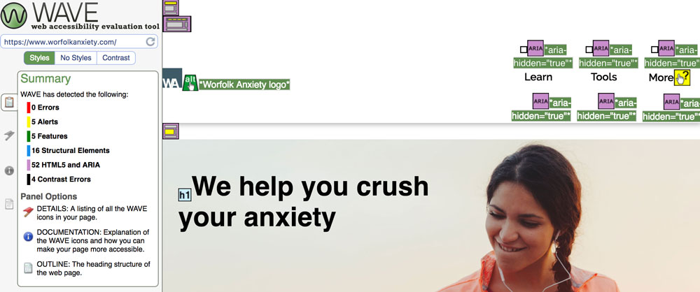
WAVE stands for the Web Accessibility Evaluation Tool. It’s an online tool that has been running since 2001 and is considered one of the best ways to test how accessible your website is.

All you have to do is enter the URL of your website and WAVE will give you a full report, including helpful suggestions and things to fix. You get a copy of your page highlighted with the information to make it easy to find.

Like everything on this list, it’s free.

Click here to access the tool.

a11y.css

This is a bookmarklet that scans your page for problems. If you are not familiar with a bookmarklet, it is a magic bookmark: you save it to your favourites and then when you click it, it will run the report on the current web page you are browsing.

It highlights areas of the page with possible errors that you can then review. It’s quick and simple to use but doesn’t offer as much depth as WAVE.

Click here to check it out.

MDN documentation

The Mozilla Developer Network is the de facto authority on how HTML works. This includes documentation on the ARIA standard, which is a standard designed to make web applications more accessible.

Even Mozilla’s documentation is rather hard to penetrate, but if you bare with it, you can get your head around it.

Click here to read the ARIA documentation.

Summary

Making your website accessible is pretty easy: it’s all about following standards and best practice, and maybe adding a few HTML attributes if you have code doing fancy things.

Doing so makes your website much easier to access for the visually impaired, which will mean a better world for them and more traffic for you.

Mobile-first navigation

Thursday, August 17th, 2017 | Programming

If you have a website, it is not enough to talk about “mobile-first design” anymore. We need to talk about mobile-first navigation, too.

The days of desktop computer terminals are gone. They’re not going anywhere, but most internet access is on a mobile device today. And has been for four years. We all design websites on these big laptop screens, but that isn’t how anybody else is looking at it.

So, we all started adopting mobile-first design.

You make the website look brilliant on a mobile, then re-arrange everything with CSS media queries so that it looks good on a desktop, too. Some people did it because they wanted to offer their users the best experience they could, others because Google announced they would be demoting sites that were not mobile friendly.

What about navigation, though?

Pages that you can read on a mobile device are a big improvement. But we forgot about navigation.

Take a look at The Washington Post’s website:

They have put a hamburger menu icon in the top left. Which is what a lot of websites do.

What’s wrong with this? It puts the menu icon in the on exact place that the majority of users cannot reach with their thumb:

Not great then.

Recently, though, there has been a move to clamp down on this. The UX community has begun to beat the drum of mobile-first navigation. Which is a good thing, because it is about time.

Thinking mobile-first

While web designers have been slow to adapt, app designers have not. Because they actually apps, no doubt. Take a look at most of them and you will see the navigation is on the bottom. Where your thumb is.

Here is the Facebook app, for example:

The NHS’s Change4Life website has embraced this principle, too. On the desktop, you get the navigation at the top:

But when you shrink your device to mobile size, the navigation fixes itself to the bottom:

Welcome to a much better world.

Leeds Pride 2017

Tuesday, August 15th, 2017 | Events

Leeds Pride continues to get bigger every year. It used to be that you could rock up to The Headrow and have an entire traffic island to yourself to watch the parade go by. Now, as you can see, the crowds are much bigger.

We weren’t clear if we were supporting Pride, or insensitively flaunting our heterosexuality by waving a baby around…

Craig’s Pride-themed tuba was very impressive, but I didn’t manage to get a good photo…

Venla at nine months

Monday, August 14th, 2017 | Family & Parenting, Photos

It is safe to say that Venla is now more dangerous than ever. She can shuffle. And she is quickly perfecting the art of speed shuffling: every day it gets faster. Which means she can get to draws, and pans, and balconies.

Time for shopping.

(more…)

Hoegaarden

Sunday, August 13th, 2017 | Food

It’s my first time cooking with Hoegaarden. It is producing some interesting colours.

The Wizard of Ads

Saturday, August 12th, 2017 | Books

The Wizard of Ads: Turning Words into Magic and Dreamers into Millionaires is a book by Roy H. Williams.

My current series of blog posts is a clearing out and putting to bed of all the books I have half-finished. Typically, when I start a book, I finish it. But Napoleon’s Hill’s Think and Grow Rich has inspired me to give up on a bad book.

The Wizard of Ads is somewhat more interesting. But the trouble is that I have now read most of it and I am still not sure what it is about. I think it is about marketing and advertising. But the author jumps around so much that it is almost impossible to follow his chain of thought.

Indeed, there may be done. There is no real structure to the book. It is a collection of anecdotes that Williams thinks will be useful to marketers.

And they are. There is a lot of gems to be gleaned from this book. Including:

  • People are always thinking: get their attention by giving them someone more interesting.
  • Don’t train your customers to wait for a sale
  • Tell a customer what they already know or suspect. They will believe you.
  • Save people time, not money.
  • Great presentation will cause people to buy emotionally.
  • Make people feel good, don’t point out problems.

But the lack of structure of clear theme to the book making the whole thing rambling and confusing. The religious references also get tedious.

The most controversial aspect of the book is probably that Williams rejects targeting and sales it is all in the copy. This goes against what most marketers teach. Indeed, it even goes against what Gary Halbert teaches in The Boron Letters: “more than anything, give me a list of qualified buyers”.

It does have a fun title, though.

Bike & Go review

Friday, August 11th, 2017 | Sport

Elina and I are considering getting back into cycling. So, I did what any self-respecting young professional would do, and went out and bought a fancy bike at the cost of nearly £1,000.

Actually, I didn’t do that. What I did do was to spend £3.80 hiring a bike from Leeds CyclePoint to see if we could both still ride a bike.

It turns out that you really do never forget how to ride one. It must be 15 years since I last rode my bike and I was rather cautious about stepping back on. But as soon as your foot goes down you’re back in old habits.

The scheme is called Bike & Go and you cannot really go wrong at £3.80 per day. You can register online and get started straight away: you don’t have to wait for your membership card to turn up.

It has plenty of features, too: a kick stand, an integrated bike lock and easy-to-use hub gears.

That said, as your day-to-day bike, it wouldn’t cut it. It’s incredibly heavy. I struggled to lift it by myself. It barely fits in the lift in our apartments (might be a problem with all bikes). The seat is rock hard: even a few minutes riding leaves you sore. The brakes don’t fill you will too much confidence, either.

But, overall, it does the job. For the price of a cup of coffee.

How I beat the 10k world record

Thursday, August 10th, 2017 | Sport

For a long time, I’ve joked that I wanted to get my 5km run time down to Mo Farah’s… 10km time.

But this was never a joke. His personal best over 10,000m is 26:47, although this somewhat lags behind the world record of 26:17 set by Kenenisa Bekele in 2005. For years, my Parkun PB (personal best) was 28:50. Quite a long way behind…

Age grading

The 5km race pace is even quicker. That world record is held by Kenenisa Bekele, too. 12:37 set in 2004.

Then there is also a system called age grading. This is how it works:

They take the fastest recorded time that someone of your age and gender has run a specific distance. Then they give you a percentage based on that. So, if you match the time, you get 100%. If it takes you twice as long, you get 50%. Four times as long, 25%, etc.

The fastest a 30-year-old male has run 5km is 13:01. Therefore, to achieve a 50% grading, I would have to run 26:02. Even tougher than matching the 10k world record, of course.

A sensational year

The last year or so have been great for my running. I’ve taken 10 minutes off my 10k time and 24 off my half marathon (though to be fair, I’ve only done two and the first one was in 25-degree heat).

You can read more about my 10km races here and half marathons here.

But my 5km times have been tumbling too…

Note that these dates are evenly spaced on the chart, but not in time. I set my PB on my 3rd ever Parkrun back in 2014 and then did not better it until a year ago. Since then, I’ve set an additional three personal bests.

The stage is set

When I turned up to Parkrun last Saturday, I was feeling okay. Not amazing, but fine.

I noticed they had pacers, so I went over to the other side. I’ve been struggling to keep my time under 27 minutes: only managed it four times, including the two PBs. Therefore, I decided to follow the 27-minute pacer and make sure I was ahead of him.

As we raced down the first straight, I saw the 26-minute pacer just ahead. So, I thought “what the hell: I need to be somewhere around him anyway” and jumped across.

It was hard going. At around 3km I started falling behind. Which is fine, expected almost, given I had never hit 26 minutes. But the roar of the marshalls and the fact that, probably for the first time ever, I managed to avoid being lapped, I got back on his tail.

As we hit 4km he confessed that we were running ahead of schedule. He slowed down a little and a cat and mouse game began as he dropped behind me, before catching up each time I tried to draw breath.

For 500 metres this continued until we entered the back straight. At “the hill” (in quote marks because it only goes up two metres, but it is surprising how many people slow down) I was loudly groaning. But as we reached the top I decided to give it one last push and went clear of him.

As I rounded the final corner, I saw a beautiful sight for tired eyes: the 25-minute pacer wasn’t that far ahead of us. I found I had renewed energy for the final kick as I chased him down with all my will.

And missed him.

It was too much ground to make up. But that did not matter. I finished a mere six seconds behind him, giving me a time of 25:06. One minute 18 seconds faster than my previous PB, faster than the 10km world record and giving me a 51.53% on the age grading; the first time I had ever been over 50%.

How did that happen?

Let’s put things into context here. Despite my attempt at epic storytelling, 25:06 is not that fast for a 30-year-old healthy man to be running 5km. But, given how much of an improvement it was over my previous PB, it is worth considering what was different.

Here are some ideas:

The time was incorrect. This was my first thought. Parkrun timings are often out, sometimes significantly. But there are a few reasons to believe this one is correct.

First, I was just six seconds behind the 25-minute pacer. Second, I was well ahead of the 26-minute pacer. Third, Strava had my km splits at significantly faster than usual.

Both Strava and MapMyRun report me running at 5:00 to 5:20 minutes per km. This would give me a typical run time of 26 minutes. But it never works out like that. However, measuring the differences, I clearly did beat the 5:00 per km on this occasion.

It’s also difficult to measure my exact time on the app because I start it from when I leave home, and stop it when I return home. So the Parkrun itself is from 2.5 km into the run and ends 7.5 in.

So, given that the Parkrun time and the pacers’ times agree, and my Strava report agrees I was on a good day, it suggests the time is accurate.

It could be that the time was off in my recent 27 and 28-minute runs, which were actually faster. I have, for example, comfortably beaten the 27-minute pacer before and been given a 27+ time.

I have new trainers. I had completely worn through the soles of my old running shoes, so I gave in and bought some new ones. It may be that they contributed to recent runs. This is only my second Parkrun in them.

I have been cross training. I have played a lot of basketball at work recently, and I’ve also been back in the pool a few times. Not many, but it could have helped.

I was just on a really good day. As an amateur runner, my performance is not very predictable. It could have been that I was just on a really good day.

And now the chart looks like this

Maybe there is hope for my hitting my target time in this year’s Abbey Dash after all.

These shoes are made for running

Wednesday, August 9th, 2017 | Sport

This is it, friends. The end of an era. I am saying goodbye to my current running shoes.

It’s heartbreaking. I have had my current trainers for many years. They have seen me through all of my races. They were even my everyday trainer until I decided I wanted to save them just for running.

But, they have had their day. I have worn through the sole so much that all that remains is the spongy padding. This means that when it rains, the shoe actually sucks up water rather than keeping my feet dry. And there is a little hole, too.

So, I’ve given in and bought some new ones.

At the Nike outlet store, of course. It’s awesome. Nobody speaks to you or tries to touch your feet. They just have boxes of shoes out that you can pull off the shelf and try on.

Will the extra padding make me soft and slow? We’ll find out soon…

The Hydro

Tuesday, August 8th, 2017 | Reviews

For week three of our swimming tour, we drove up to Harrogate to visit The Hydro.

Changing facilities were okay. It’s all one big mixed changing room with individual cubicles. This made it quite difficult to get Venla changed as we had to use a changing table, which is complicated when everyone is wet.

The pool itself very good. The main pool actually has a deep end. It claims to be 1.8 metres deep, but my measurement put it at about 1.7 metres. They had three swim lanes as well as a general area.

The children’s pool was very warm and had a slight gradient, too. In the shallow end, I could sit on the bottom while holding Venla. There were lots of toys and floats about. Venla really enjoyed the watering cans.

They have a diving pool, too.

The “session” was just general swimming all morning. This was great as it meant we did not have to be there for a specific time or get kicked out.

The viewing area is much nicer than other pools. They have a cafe that serves a good range of hot food including breakfast and main meals, and you can sit inside or pool side. It is cash only, though.