Posts Tagged ‘web design’

ChrisWorfolk.com v6.2

Tuesday, February 7th, 2017 | News

Earlier today, I pushed version 6.2 of my website live. I think we can say with reasonable certainty that you will be less excited about than I am. However, life is not about the opportunity you are handed. It is about what you do with it. So smile and think to yourself “wow, that is interesting!”.

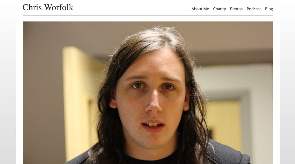
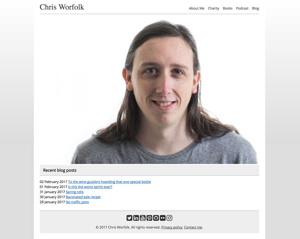
Not much has changed. It looks mostly the same. On the homepage, the giant picture of my ugly face has been replaced by another giant ugly picture.

Books page

I have replaced the photos link at the top (photos can now be found in the “about me” section) with a page detailing all of my books. I like my photos, but most people are probably not looking for a gallery of shots when they visit the site. It is much better to follow me on Flickr.

About me sections

Most people are probably looking for one of three things when they visit my site: to find out more about my tech consultancy, to explore my food writing or to check out my work in mental health and wellbeing. To make this easier, the about me section is now divided along these three lines.

Social media

I’ve added all of my social media links to the footer. Why anyone would want that much Chris, I have no idea. Probably nobody does. But Elina might find them useful.

Anxiety Leeds make-over

Saturday, December 31st, 2016 | Foundation

The Anxiety Leeds website has had a small makeover. We have been running the WordPress Twenty Eleven theme since we started in 2013. It has been good to us, and the newer themes have never really looked as good.

However, it did take up a huge amount of space, especially on mobile devices. Therefore, I have put together a custom design, based on the popular Sela theme. It functions well on both desktop and mobile. We have also been busy improving the content and making pages easier to find.

Autoprefixer

Saturday, June 4th, 2016 | Programming

html-code

Web browsers come in various shapes and sizes: different users will have different ones, and inevitably different versions of the same one. When CSS3 arrived browsers began adding support for it before the specification had been finalised and so used vendor prefixes.

The result, now we have a standardised CSS3, is that some users have proper CSS3 support and some have the support, but only behind a complicated series of vendor names. Therefore, if you want to use flexbox for example, you cannot just rely on display: fiex; as for some users it will only work with the appropriate vendor prefix.

This means you have to tediously insert all of these vendor prefix statements to get cross-browser compatibility. However, there is a tool called Autoprefixer that takes this hassle away. It is an NPM module that converts your regular CSS into CSS with vendor prefixes. You write:

display: flex;

And you get:

display: -webkit-flex;
display: -ms-flexbox;
display: flex;

This means you have to compile your CSS. However, if you are already compiling from LESS or SASS, it’s really easy to integrate it. On one of my current projects I already had Gulp compiling SASS, so it was one-liner to add the step in. SitePoint have a tutorial on how to set it up.

ChrisWorfolk.com v6.1

Friday, May 13th, 2016 | News

version6_1

Version 6 of my website has been around for a few years now and I am pretty happy with it. It is simple, responsive and says what it needs to say. However, the internet is an ever-evolving place, and so an update felt in order. Here is what has changed in version 6.1.

Design

I have switched from Arial to Open Sans. It is an elegant font and as you can probably guess from the name, open source. It is used by Google as their standard font. Along with the font change, the font size has now been standardised, and is bigger than it used to be. This makes everything easier to read, especially on a smaller screen.

There is also more space, in two respects. First the headers are now bigger and more spaced out. Second the header will no longer stay glued to the top of the page if you are on a small screen. Mobile users will now see the navigation bar disappear as they scroll, freeing up more reading space.

design

Content

The content pages have had an overhaul. Some of the information on the about me and charity pages was getting a little old. This has now all been updated. The videos page now works with YouTube’s new feed, so you can once again see a list of video previews on the page.

Images

Previously, the images were a little on the small side. They worked fine on the tiles you see on a larger screen, but did not fit to 100% width on a mobile screen. These have all now been replaced by larger versions so no matter what size screen you have, you will see the perfect image size.

imagery

Blog

My blog has received some attention too. I have removed some of the distracting features like the tag list included in the post listings. The date and categories are now in the sub-heading bar, with no meta data underneath until you click through into the post’s page.

The sidebar has also been moved to the bottom of the page. This is where it was on mobile anyway. Instead of getting a list of 100 months to browse, you now get the past year with the option to click through to the archives page if you want to see a full list. I’ve also added a sitemap to make it easier to search.

blog

Speed

Those larger images eat up a bit more bandwidth. Luckily, speed improvements elsewhere in the site help make up for it. All of this is ‘behind the scenes’. Images and static assets now have appropriate cache headers, the CSS is compressed and everything is delivered via gzip. The homepage’s blog post feed now loads faster too.

Myth CSS preprocessor

Wednesday, January 20th, 2016 | Programming, Tech

myth-css-preprocessor

Myth is a CSS preprocessor that allows you to write easier-to-manage CSS, similar to LESS and SASS. The difference with Myth though is that you are writing “pure CSS” while still using features that will be available in the future (such as variables and maths). It then acts as a polyfill for browsers that do not support it.

You can see the full spec on the Myth website.

Should you use it instead of LESS and SASS? In my opinion, no. Not yet anyway. While it does offer some of the features, it does not offer the really useful ones yet. Nested roles and mixins are the big winners for me. Myth does not have these. Nor does it support includes.

It’s one advantage is that it does fill in prefixes. So if you are using flexbox, you can just have a flexbox entry, rather than the endless series of browser-targetted prefixed flexbox commands you currently have to use. You can do this using mixins in LESS and SASS, but it is messier than the way Myth implements it, where you just type the standardised CSS property.

While possibly not that useful right now, Myth is one to watch for the future.

Xenu’s Link Sleuth

Tuesday, June 23rd, 2015 | Programming

It is super easy to miss broken links on your website. Even if you test it rigorously, it can be difficult to catch them all. That is where an automated crawler can come in useful. Xenu’s Link Sleuth is one such tool.

It only runs on Windows, so I had to run it in a VM. It is also rather a blunt instrument – it crawls everything even though you can be pretty certain that if you have checked one article ID page, they are all going to work. But those few points aside, it is very useful.

It rapidly spiders all of your pages and reports back on both broken links and redirects. It checks CSS, JavaScript and images resources too, and you have the option to check external URLs as well so you get full coverage. It then spits out a HTML report. It is amazing how many little links you find that need fixing when you run it. Well worth spending a bit of time on.

Speeding up Leeds Restaurant Guide

Friday, June 12th, 2015 | Limited, Programming, Tech

restaurant-guide-website

Leeds Restaurant Guide is incredibly detailed covering so many restaurants with high quality content and imagery. So it seemed only fitting that I should pay as much attention to the presentation as I do the content.

I’ve been using Google’s PageSpeed Insights tool to debug it. Ironically, PageSpeed Insights spends a lot of time complaining about the Google AdSense code that they provide to me. It does however provide some useful tips too.

Compression

Gzip compression costs almost nothing and can drastically reduce the file size you are sending to the client. The server compresses it and the client uncompresses it all of which is done transparently to the user.

It is pretty easy to configure using Apache’s mod_deflate module, and I’ve blogged about how to get it working on cPanel on Hardware Tutorials.

Expiry headers

If you have Apache’s mod_expires, and you almost certainly do, you can set default expiry headers for content using your .htaccess file.

<IfModule mod_expires.c>
    ExpiresActive On
    ExpiresByType text/css "access plus 60 minutes"
    ExpiresByType image/jpeg "access plus 1 day"
    ExpiresByType image/jpg "access plus 1 month"
    ExpiresByType image/png "access plus 3 months"
</IfModule>

This will tell the client it can safely cache the content for a while. Put whatever values in that you think are sensible.

Minify your CSS

Recently I wrote about how to use Gulp to set up a task to compile your SASS/LESS stylesheets. This included instructions on how to minify your CSS. Even if you are just using plain old CSS, you could still create a task to create a minified version.

Minification takes out all the spaces, comments and other unrequired characters so that you have less data that needs to be transferred to the client.

Using Gulp to compile stylesheets

Thursday, June 11th, 2015 | Limited, Programming, Tech

gulp

If you’re doing a lot of CSS in your web development, you may have taken to using SASS or LESS to allow you to better organise, code and maintain your stylesheets. These are both great tools. However, the one thing that annoys me is having to remember the command to compile them, given it is often different for each project.

Luckily Gulp, a Node-based task runner, can come to the rescue.

This has the added advantage that you can also pipe it through other tools, allowing you to create maps and minify the CSS all in one command that makes it super easy.

Firstly, you need to add the dependencies so that NPM knows what to install.

{
    "devDependencies" : {
        "gulp" : "*",
        "gulp-sass" : "*",
        "gulp-minify-css" : "*",
        "gulp-sourcemaps" : "*"
    }
}

You can then run NPM install to get all the modules you need. If these are the only modules you are using you will probably need to modify your .gitignore file to ignore the node modules directory.

node_modules/

Now we can create a gulpfile.js in the root of our project directory that will define the tasks we want to run.

'use strict';
 
var gulp       = require('gulp');
var sass       = require('gulp-sass');
var minifyCss  = require('gulp-minify-css');
var sourcemaps = require('gulp-sourcemaps');
 
gulp.task('sass', function () {
    gulp.src('./sass-files/*.scss')
        .pipe(sourcemaps.init())
        .pipe(sass().on('error', sass.logError))
        .pipe(minifyCss({compatibility: 'ie8'}))
        .pipe(sourcemaps.write('./sass-maps'))
        .pipe(gulp.dest('./stylesheets'));
});
 
gulp.task('sass:watch', function () {
    gulp.watch('./style/*.scss', ['sass']);
});

The first task creates a “gulp sass” command that takes the SASS file, converts it to CSS, minifies it, builds the source map and then writes it out. I’ve set the compatibility to ie8, though it could also be ie7, and defaults to ie9.

The second task creates a “gulp sass:watch” which watches the files for changes and then calls the first task whenever it detects a change.

If you are using LESS you will need a slightly different set of dependencies.

{
    "devDependencies" : {
        "gulp" : "*",
        "gulp-less" : "*"
    }
}

The tasks are slightly different too, but basically do the same thing.

'use strict';
 
var gulp = require('gulp');
var less = require('gulp-less');

gulp.task('less', function () {
  return gulp.src('./app/resources/less/*.less')
    .pipe(less())
    .pipe(gulp.dest('./app/webroot/css'));
});

gulp.task('less:watch', function () {
    gulp.watch('./app/resources/less/*.less', ['less']);
});

The end result of this is that rather than remembering what the specific paths for any project I want to work on, I can create a Gulp task and simply run “gulp sass” or “gulp less”. I could even just rename them to “gulp css” to use the same name on every project I work on.

Tools for validating your website

Wednesday, May 27th, 2015 | Programming, Tech

There are some great online tools for validating that your website is looking and working well. Of course there are loads of these and many of them we’ve been using for years. Below though, I’ve listed a few I’ve been using the most in recent times or that are often overlooked.

W3C validator

An oldie but a goodie. The W3C validator ensures that your mark-up is valid. This is good for two reasons. One, it will find any problems, missing closing, tags, etc, that may be causing weird problems. Two, it will also point out stuff that you could be doing better like semantic tags and relevant meta tags.

http://validator.w3.org/

w3c-validator

Mobile friendly checker

Google are starting to crack down on websites that do not consider mobile users. Of course we all know we should be building mobile friendly websites, indeed, it should be mobile first these days! But it is hard to debug sometimes, especially given the fragmentation of devices.

Luckily Google now provides a tool that will give you a pass and fail, as well as showing you a preview of the site on an Android device. It’s not perfect, sometimes it fails to load assets and you have to come back later, but it is still an awesome tool.

https://www.google.co.uk/webmasters/tools/mobile-friendly/

Google Developers testing tool

Over on the Leeds Restaurant Guide we expose our reviews using the hreview schema. This means that sites like Google can see what ratings we give restaurants and put them directly in the search results. To check it is working correctly, you can use Google’s testing tool.

https://developers.google.com/structured-data/testing-tool/

Facebook Debugger

Recently I wrote about the Open Graph protocol which allows you to tell social networks (mostly Facebook) what titles, images and descriptions you want it to use when sharing a web page.

Facebook have a debugging tool to test your tags are working.

https://developers.facebook.com/tools/debug/

Lyrics Burger is now responsive

Saturday, May 9th, 2015 | News

I am sure that that like myself, when you want to look up some song lyrics, you instantly head off to Lyrics Burger. After all, it is the number one place to go for song lyrics in my opinion. Well, you will be pleased to know that it is now even better!

First and foremost it is now responsive, and looks great on a mobile device.

lyrics-burger-responsive

But there are lots more exciting changes both over and under the hood too. The URLs have all changed to nicer, cleaner ones. All the old ones will still work of course and redirect to the new location. We have also made the design cleaner (thought it was already full of semantic HTML5 goodness), improved the adherence to HTML standards, and added open graph tags so it is now even easier to share!