Posts Tagged ‘web design’

Upgrading from Slim 3 to Slim 4

Friday, September 18th, 2020 | Programming

Slim is one of my favourite PHP microframeworks and many websites are built on Slim 3. I have recently moved to Slim 4 and thought I would document the upgrade process for anyone else looking to make the leap.

Dependencies

Slim 3 came with its own dependency injection container. This is no longer the case. Therefore, we need to bring one in, such as php-di that Slim supports out-of-the-box. We will also need a PSR-7 library and the Slim HTTP helpers.

"slim/slim": "4.*",
"slim/psr7": "1.*",
"slim/http": "1.*",
"php-di/php-di": "^6.1",

Creating the app

In Slim 3, we created the app and then accessed the container.

$app = new \Slim\App([
    'settings' => []
]);

$container = $app->getContainer();

In Slim 4, we create the container then attached it to the app.

$container = new \DI\Container();
\Slim\Factory\AppFactory::setContainer($container);
$app = \Slim\Factory\AppFactory::create();

You can still access the container in the old way and inject dependencies into it, but you need to manually pass it into the app as above.

Accessing dependencies

Now we are using our PSR-11 DI of choice, we need to change how we access our dependencies. Previously, wee could use the Slim shorthand.

$db = $this->ci->db;

Now we need to use the PSR-11 standard.

$db = $this->ci->get('db');

Exception handling

Previously, we could set error handling using the dependency injection container.

$container['notFoundHandler'] = function ($container) {
    return function ($request, $response) use ($container) {
        $controller = new \App\Controller\ExceptionController($container);
        return $controller->notFound($request, $response);
    };
};

In Slim 4, we need to use the bundled middleware.

$errorMiddleware = $app->addErrorMiddleware(true, true, true);

$errorMiddleware->setErrorHandler(
    Slim\Exception\HttpNotFoundException::class,
    function (Psr\Http\Message\ServerRequestInterface $request) use ($container) {
        $controller = new App\Controller\ExceptionController($container);
        return $controller->notFound($request);
    });

This also means changing the exception controller, too, if you use one. In Slim 3, we would still get a response object passed in.

    public function notFound(Request $request, Response $response)
    {
        return $this->render($response, 'not-found.html');
    }

With Slim 4, we need to create our own.

    public function notFound(Request $request)
    {
        $response = new \Slim\Psr7\Response;
        return $this->render($response, 'not-found.html');
    }

That should take care of most of the changes. If you run into anything else, let me know, and I’ll update this article.

CSS Grid course

Wednesday, May 13th, 2020 | News

I’m pleased to announce the launch of my new course, Introduction to CSS Grid. If you are a web developer that is not using grid yet, now is the time to jump on board before you get left behind. Grid is amazing: it is like flexbox on steroids. It is the thing that finally gives us everything we had in table-based layouts and lots more.

Here is the trailer:

Google Tag Manager course

Saturday, April 18th, 2020 | News

I’ve launched my latest course, Google Tag Manager for Developers. It is predominantly aimed at web developers who want to save time but is also suitable for digital marketers and entrepreneurs who manage their own websites.

Google Tag Manager is a platform that allows you to quickly and easily manage analytics scripts and pixels. Even as a developer, who could write it all myself, I use Google Tag Manager to save valuable time and effort. The course covers getting setup, using some of the advanced features, and integrating Google Analytics and Facebook Pixel.

Here’s the video:

You can preview the course and find out more on the course homepage.

Web Design Accessibility Certificate

Wednesday, March 18th, 2020 | News

I’m pleased to announce the launch of my new course on Web Design Accessibility.

If you want to make the web a better place for disabled people, help improve your conversion rates, and add a valuable skill lt your CV, this is the course for you. We will look at a range of accessibility issues and conditions, the tools we can use to help us and the principles of inclusive design.

The course is usually $99.99 but if you use this coupon link you can register for free as an early bird student. Offer expires Friday!

IRONMAN’s technology problems

Monday, October 7th, 2019 | Tech

Last week, I wrote about how IRONMAN, as an organisation, do not always have the best reputation among athletes. I do not think this is justified at their events. However, it is frustrating that nobody within the IRONMAN organisation has ever used a computer. Here are some of the problems we have run into.

Registration not working

It was a pain to get through the registration form to create my profile. When I came back a few months later, they had changed their registration system and I had to re-register. Their new form did not work at all. There was no error; the form simply did not do anything.

When I emailed support, they asked me to re-try it. This time it did not work because something had been created in the background and now I could not register with the same details.

Profile problems

Once I was registered and logged in, my upcoming race was missing. I had to email support to get them to sort it out. It took a few emails back and forth to get it sorted.

When I turned up in Weymouth, my date of birth was incorrect. It was a simple matter to get it sorted with the team there, but again frustrating.

Club registration

You cannot just enter your club in your registration form. You have to get the club to give IRONMAN a bunch of personal details for them, too. Graeme was kind enough to do this so that I could list Hyde Park Harriers as my club.

However, they never sent the email confirmation and when I contacted support a month later, they said they had lost of the club registration and we would have to complete it all again if we wanted the club to be listed.

Online store

The online store does not work. I have tried to buy some stuff several times and each time it says that the item is in stock but when I try to add it to my basket it says they have no stock left.

Website design

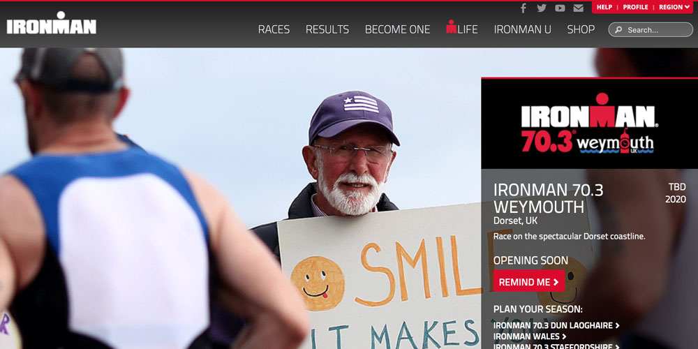
Oh my, have you ever seen a website designed as badly as IRONMAN?

It is not a mobile-first design, despite mobile traffic overtaking desktop traffic years ago. In fact, if you try to access many of the pages on the website, you do not even get a terrible desktop-designed page. You get a page saying “not available on mobile” like it is the Nineties.

The website is slow.

The navigation is confusing. If you go to a particular race, you have the main website navigation across the top and you have to click a little red button at the bottom of the page instead to access the pages about that particular race.

It is hard to get the information you want. I was trying to find the results for IRONMAN Wales from last year. They are not there, as far as I can tell.

Their SEO is also terrible. Every time I searched for IRONMAN Weymouth, I would get the discontinued full distance race, rather than the half distance that is still running. This would be a relatively easy fix in a sitemap or a robots.txt.

Why does Mac VoiceOver keep saying the word “simul”?

Saturday, January 12th, 2019 | Tech

I’m currently working with a client to improve the accessibility of their website for visually impaired users. This has involved a lot of time working with screen readers. As part of that, I have found a rather weird bug with Mac’s VoiceOver. It keeps saying the word “simul”.

Which isn’t a word. Maybe it’s saying simmul or simmel, or something else. None of these are words.

It happens when we give it a range to read. Something like “4-6”. The screen reader says the first number, then goes suspiciously quiet and says simul, and then starts building back up to regular volume as it gets to the final number.

I even asked about it on Stack Overflow, and everyone else was confused, too.

I wondered whether it might be a language issue. So, I tried adding a custom pronunciation, and double-checked the HTML tag had a lang attribute set to en-gb. Alas, no luck.

This is only a problem on Mac: TalkBack on Android works fine, for example.

In the end, I was able to get it to read correctly by changing the voice. By default, macOS comes with Daniel Compact set as the voice. However, when I switched to Daniel, Kate, or Kate Compact, it read it out correctly.

In a way, this is frustrating, because there is no much we can do to fix it. It’s a bug with the voice in Mac. But it is at least somewhat comforting to know that I wasn’t making some obviously silly mistake.

How to stop VoiceOver saying the word “group”

Thursday, January 10th, 2019 | Programming

You’re trying to make your website accessible. Lovely stuff. But because screen reader technology is so bad, you need to add a bunch of inline span tags with the aria-label attribute on them so that you can add additional context, or, more usually, use some kind of hack to get around a screen reader bug.

This works well. However, it also splits the whole thing into separate groups. Consider the following example:

An annual subscription costs £20.00 per year.

Looks good. Except for VoiceOver on Mac and iOS, and probably other screen readers, too, will read out something like this:

Pound two zero zero zero

Oh no! It totally ignored the decimal point and now your user, if they are able to track the weird way it read out individual numbers, thinks that your product costs two thousand pounds. So, our old friend the Aria label is here to help.

An annual subscription costs <span aria-label=”twenty pounds”>£20.00</span> per year.

Hurray! It now sounds like normal language. But it’s still confusing. Now the screenreader reads them out as three separate blocks. “An annual subscription.” “Twenty pounds, group.” “Per year.” The user has to navigate through all three of them even though it is one sentence.

The fix

To fix it, we can use the role attribute. Sometimes.

If we set it to role="text" it will work in WebKit. For example:

<span role=”text”>An annual subscription costs <span aria-label=”twenty pounds”>£20.00</span> per year.</span>

Now it will read out the entire sentence as one string, but still using the Aria label.

Is role=”text” a thing?

No. That’s the drawback. it was proposed to be included in the Aria spec, but nobody could agree on whether it should be a thing or not. So, it was left out. Therefore, it is not implemented everywhere.

It is implemented in WebKit, so will fix the problem on Chrome, iOS, etc. But it won’t fix it in some other browsers. And, you might get pulled up by linting tools and validators because it is not part of any formal specification.

Where can I put it?

Anywhere you like given that it is a made up attribute.

But there are some things to be cautious of. It should only go on a block of text where you do not mind losing any of the context inside of it. If you have an element inside the paragraph, for example, that should be treated as a separate group, then leave it off.

It shouldn’t on headings because you don’t want to lose the context. Instead, put a span tag inside the heading with it on.

Also, you need to ensure you are using the aria-label attribute for anything inside. Normally, you can use an abbr tag with a title attribute and the screen reader will read out the title. However, if you wrap it in a role="text", this will only work if you use an aria-label instead/as well as the title attribute.

How I optimised Leeds Anxiety Clinic

Monday, October 29th, 2018 | Tech

We’re taking the lean startup approach with Leeds Anxiety Clinic and trying not to build anything unless we absolutely need it. As a result, when I originally built our website is was functional but not particularly fast.

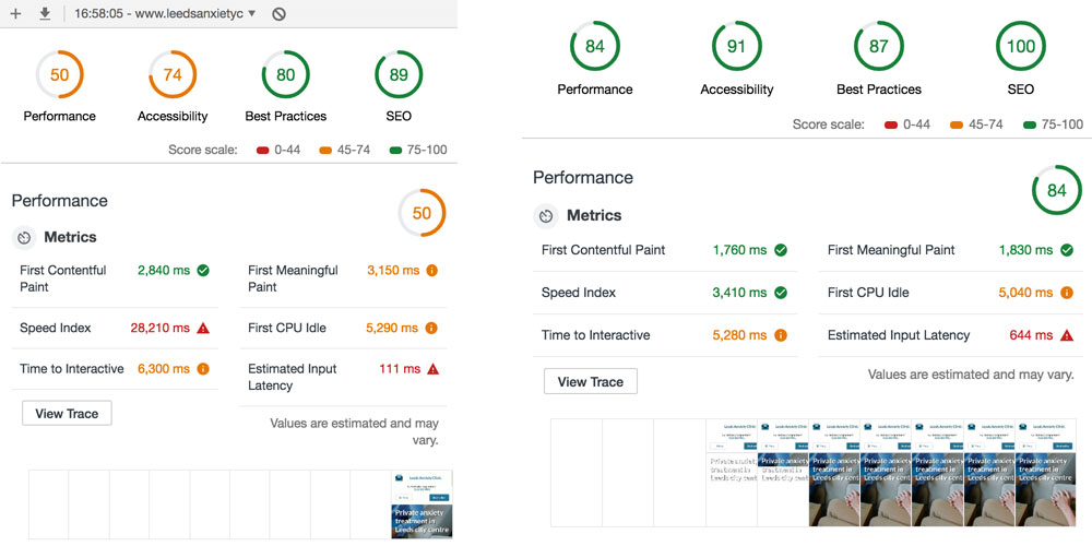
Now that we’re up and running and have clients coming through the door, I’ve been back over the site to make it faster and better. Below, I’ve detailed what I’ve done. Here’s a before and after using the Lighthouse audit tool:

Turn cache headers on

There were no cache headers on our images, CSS or JavaScript. Part of this was that I was still making changes to the JavaScript and didn’t have any cache-busting functionality in the site yet. Now that I do, I could safely let the browser cache everything for a month.

Replacing jQuery

jQuery is a library whose time has been and gone. But it does make it super easy to throw in some functionality. Now that I have a proper JavaScript setup, however, and as jQuery was mostly just animating things, I replaced it with native CSS animations and vanilla JS.

Compressing the JavaScript

As there was no JavaScript preprocessing going on, it was not compressed. Ironically, this hasn’t made it any smaller because I’ve now got the Webpack bootstrapping in the file. However, it does mean I can easily load in additional modules, which I discuss below, to help with other areas of the site.

Gzip compression

This is a super-easy win because all you have to do is put it in your Apache config and the server does all of the rest.

Async loading of web fonts

We had a total of three blocking font calls in the header of the page. All of this has now gone. I’m using webfontloader to load in the two variations of Lato that we are using.

Fontawesome is used for icons and is loaded in using a classic link tag, however, I’ve moved this link tag to the bottom of the page so that the initial content can be loaded first. On slow connections, this means the icons are missing for a fraction of a second when you load the page but I think it is worth it.

If I was looking to optimise further like I do with Worfolk Anxiety, I would select the individual icons I want, base64 encode them and put them directly in the CSS. But that seems overkill here for the moment.

Finally, I’ve set the font-display CSS property to fallback so that if the fonts are slow in loading, the text will be rendered away using a system font.

Webp images

Oh my god, webp images are so good. They’re like half the size of the already optimised JPEGs and PNGs that they are replacing.

Unfortunately, few browsers support them yet. It’s basically just Chrome (on desktop and Android). So, I’m using the picture tag with a fallback, as everyone does. I can’t wait until webp gets wider adoption.

Unfortunately, there is no way to do a safe fallback in CSS so my background images remain old JPEGs for everyone.

NHS Beta homepage

Saturday, September 23rd, 2017 | Tech

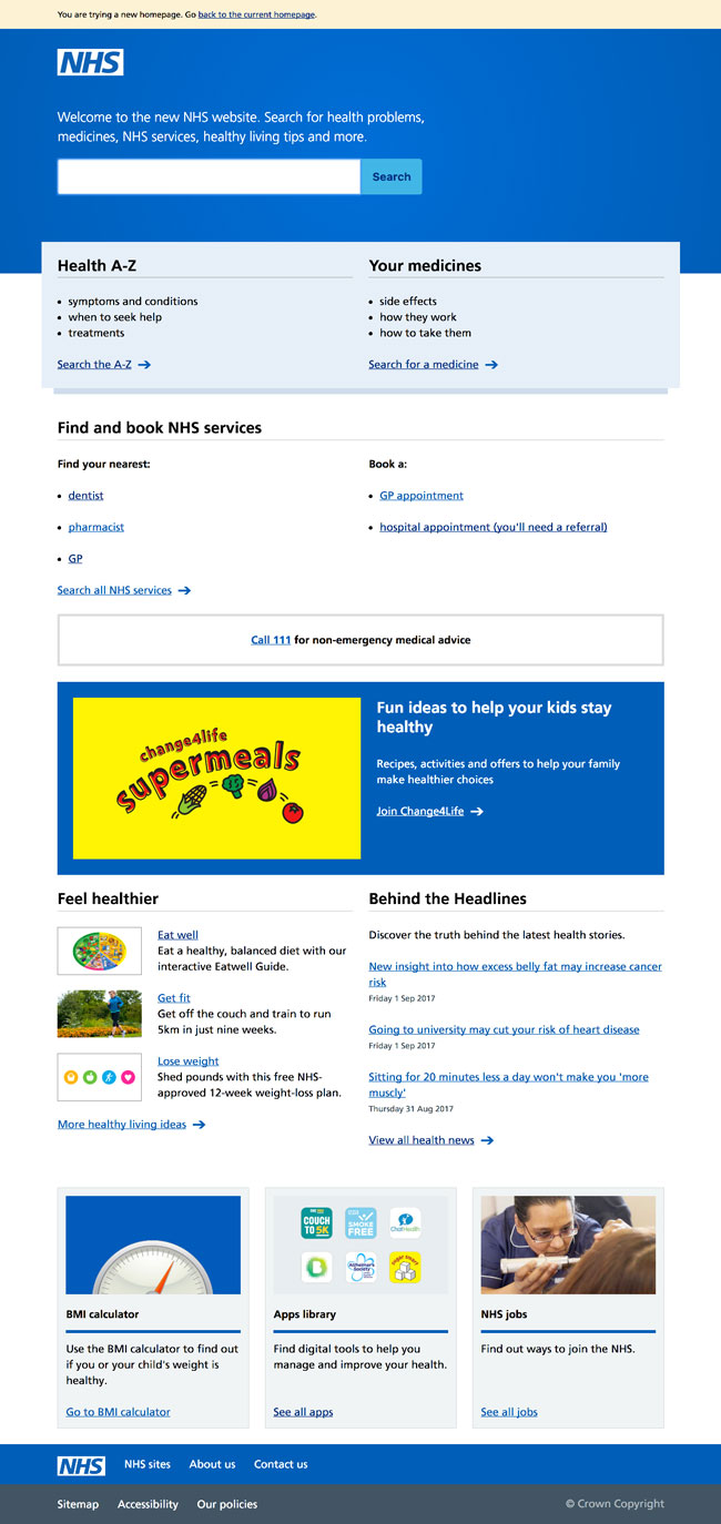
I’ve been working with the NHS to deliver a new homepage for the site that will replace NHS Choices. At the Health Expo this month, we launched the new homepage on the NHS’s beta platform. You can check it out here.

Mobile-first navigation

Thursday, August 17th, 2017 | Programming

If you have a website, it is not enough to talk about “mobile-first design” anymore. We need to talk about mobile-first navigation, too.

The days of desktop computer terminals are gone. They’re not going anywhere, but most internet access is on a mobile device today. And has been for four years. We all design websites on these big laptop screens, but that isn’t how anybody else is looking at it.

So, we all started adopting mobile-first design.

You make the website look brilliant on a mobile, then re-arrange everything with CSS media queries so that it looks good on a desktop, too. Some people did it because they wanted to offer their users the best experience they could, others because Google announced they would be demoting sites that were not mobile friendly.

What about navigation, though?

Pages that you can read on a mobile device are a big improvement. But we forgot about navigation.

Take a look at The Washington Post’s website:

They have put a hamburger menu icon in the top left. Which is what a lot of websites do.

What’s wrong with this? It puts the menu icon in the on exact place that the majority of users cannot reach with their thumb:

Not great then.

Recently, though, there has been a move to clamp down on this. The UX community has begun to beat the drum of mobile-first navigation. Which is a good thing, because it is about time.

Thinking mobile-first

While web designers have been slow to adapt, app designers have not. Because they actually apps, no doubt. Take a look at most of them and you will see the navigation is on the bottom. Where your thumb is.

Here is the Facebook app, for example:

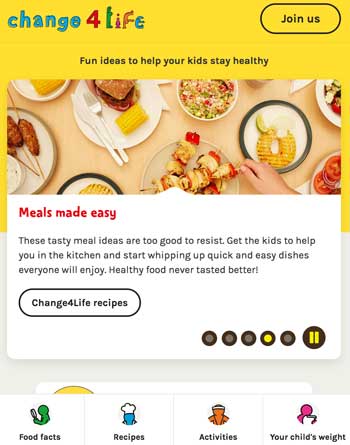
The NHS’s Change4Life website has embraced this principle, too. On the desktop, you get the navigation at the top:

But when you shrink your device to mobile size, the navigation fixes itself to the bottom:

Welcome to a much better world.