COVID-19: What’s changed today?
Monday, March 23rd, 2020 | Health & Wellbeing
The WHO has now released today’s situation report. Here are some of the headlines:
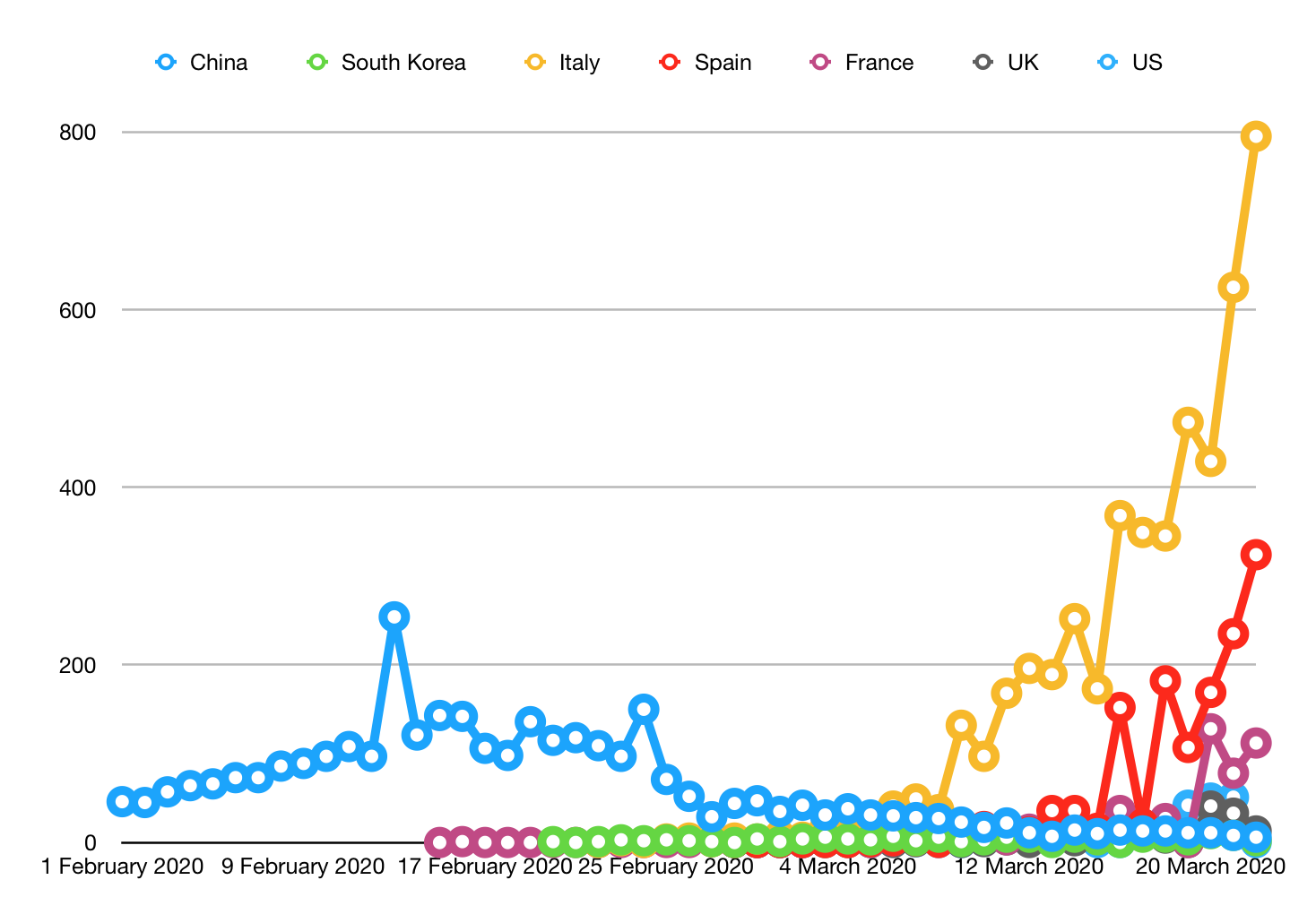
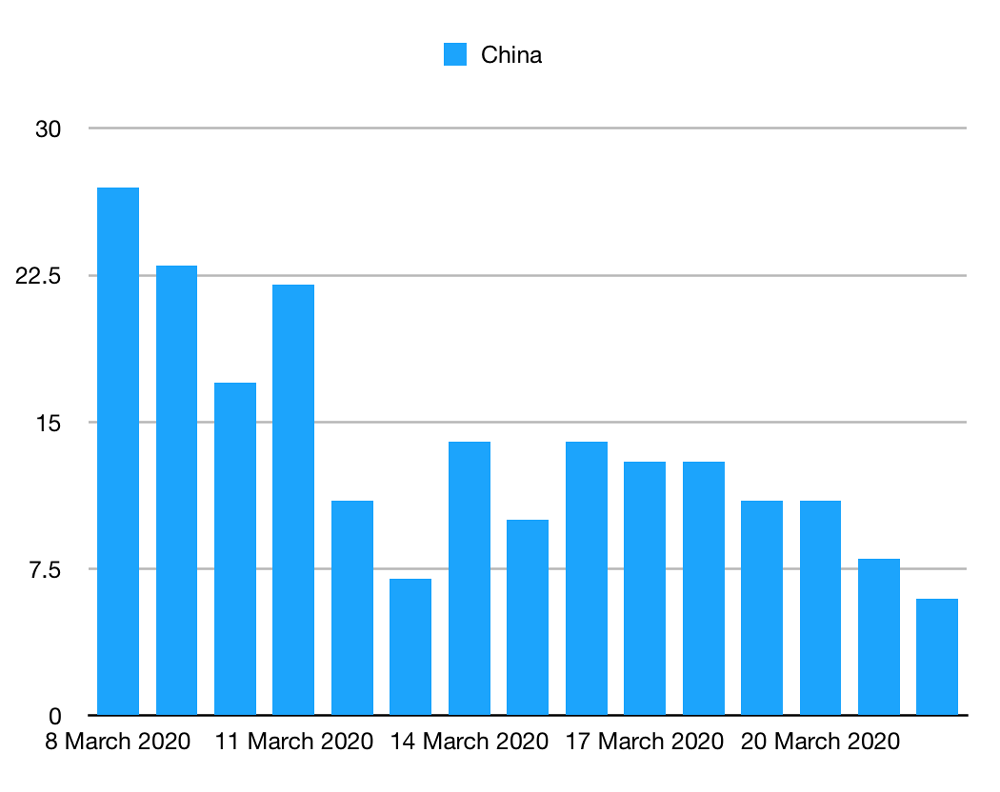
- China and South Korea are still seeing deaths, but not many.
- Italy recorded 649 deaths, compared to 795 yesterday. It has dropped before and then continued to rise, though.
- The US has reported 201 deaths today, doubling their total. As none were reported yesterday, could just be delayed figures?
Let’s update the graphs.
Deaths per day
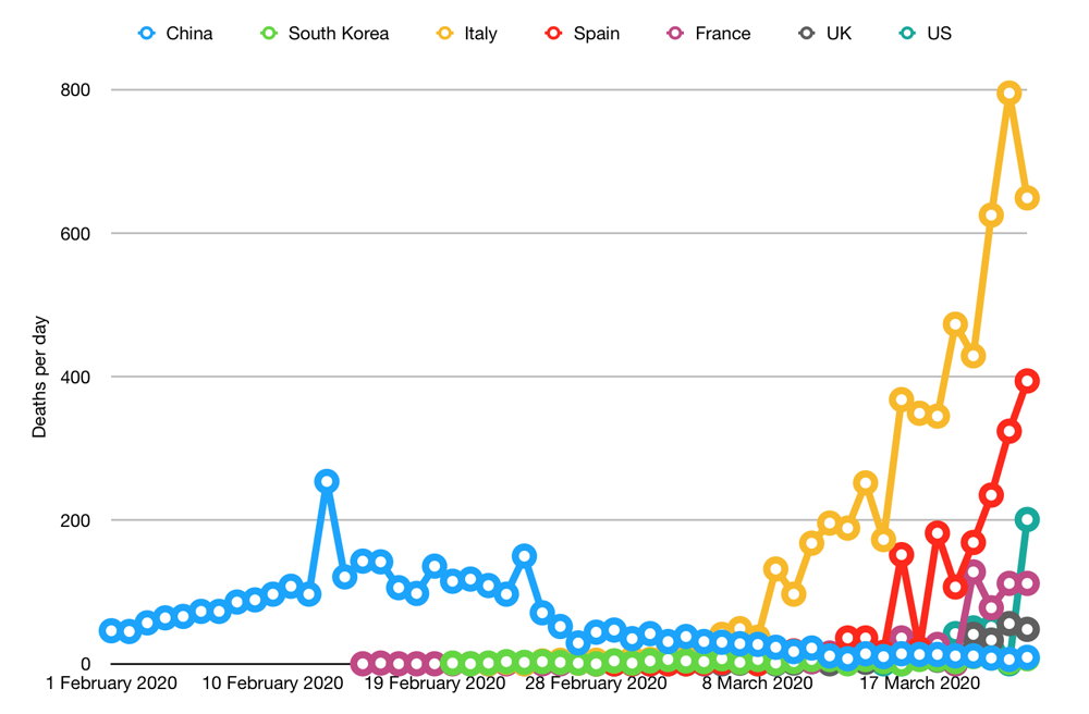
Let’s hope today’s result is a sign that Italy is turning the tide and not just an anomaly. On the other hand, let’s hope the US result is an anomaly based on delayed data and goes back to normal tomorrow.
My previous graph showed the incorrect figure for the UK yesterday, which I have now corrected in this graph.
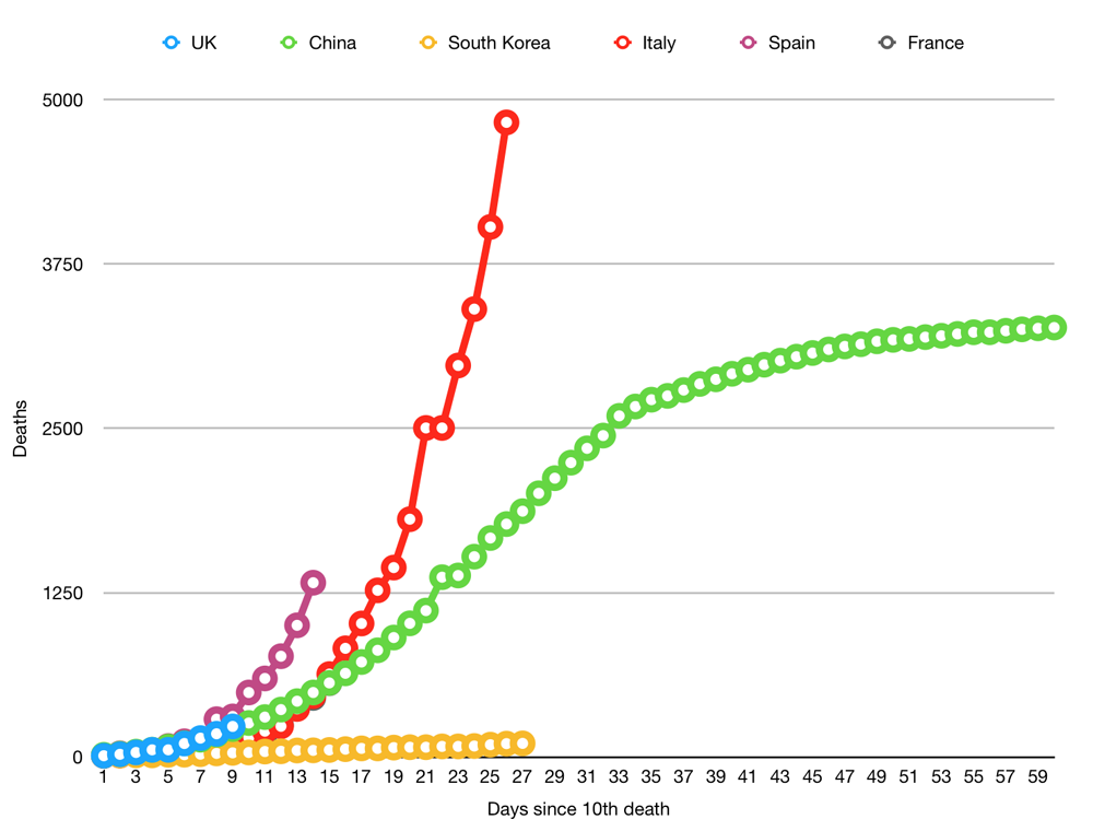
Cumulative deaths
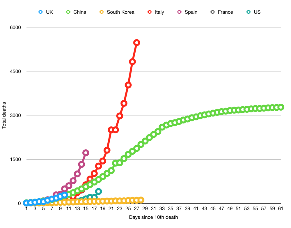
Nothing terribly important to report here, I think. Italy and Spain are still on scary trajectories. It’s too early to say what is going on in the UK. We might follow China. But it is important to remember that Italy weas behind China until day 15. We’re only on day 10, so there is plenty of time for it to accelerate on Italy’s path.
Massively simplistic rules of thumb are a bad idea. But let’s make some anyway. It’s unlikely to start magically dropping at this point (see below), so anything below or around 331 cumulative tomorrow would be a good result. Anything significantly above that would be a bad result. And anything around the 381 mark would be a terrible result.
Social distancing has a delayed effect
One final thought: there is probably at least a 14-day delay between implementing social distancing and seeing any benefit. The virus has an incubation period, then five days of fever and coughing, then the respiratory issues kick in.
We implemented our first set of social distancing (telling people to work from home and not gather in groups) on Tuesday 15 March. That’s six days ago.
We implemented our second set, closing schools and telling people “seriously, stay away from each other” on Saturday 21 March. That was two days ago.
That means that we have 8-12 days of nobody was social distancing damage before we even get to the “we told you all to distance, not cough on each other in the royal parks” damage, which may or may not be resolved. What you do today affects what happens in the ICU two weeks from now.
The WHO has now released today’s situation report. Here are some of the headlines:
- China and South Korea are still seeing deaths, but not many.
- Italy recorded 649 deaths, compared to 795 yesterday. It has dropped before and then continued to rise, though.
- The US has reported 201 deaths today, doubling their total. As none were reported yesterday, could just be delayed figures?
Let’s update the graphs.
Deaths per day

Let’s hope today’s result is a sign that Italy is turning the tide and not just an anomaly. On the other hand, let’s hope the US result is an anomaly based on delayed data and goes back to normal tomorrow.
My previous graph showed the incorrect figure for the UK yesterday, which I have now corrected in this graph.
Cumulative deaths

Nothing terribly important to report here, I think. Italy and Spain are still on scary trajectories. It’s too early to say what is going on in the UK. We might follow China. But it is important to remember that Italy weas behind China until day 15. We’re only on day 10, so there is plenty of time for it to accelerate on Italy’s path.
Massively simplistic rules of thumb are a bad idea. But let’s make some anyway. It’s unlikely to start magically dropping at this point (see below), so anything below or around 331 cumulative tomorrow would be a good result. Anything significantly above that would be a bad result. And anything around the 381 mark would be a terrible result.
Social distancing has a delayed effect
One final thought: there is probably at least a 14-day delay between implementing social distancing and seeing any benefit. The virus has an incubation period, then five days of fever and coughing, then the respiratory issues kick in.
We implemented our first set of social distancing (telling people to work from home and not gather in groups) on Tuesday 15 March. That’s six days ago.
We implemented our second set, closing schools and telling people “seriously, stay away from each other” on Saturday 21 March. That was two days ago.
That means that we have 8-12 days of nobody was social distancing damage before we even get to the “we told you all to distance, not cough on each other in the royal parks” damage, which may or may not be resolved. What you do today affects what happens in the ICU two weeks from now.
