How many people will die from COVID-19?
Tuesday, April 14th, 2020 | Health & Wellbeing

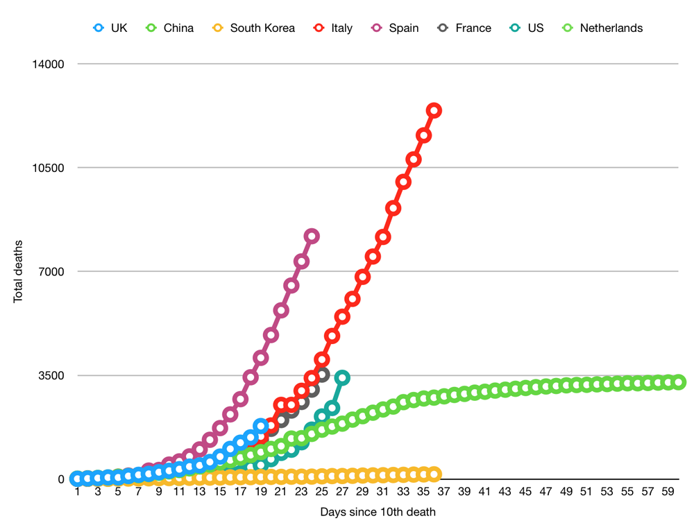
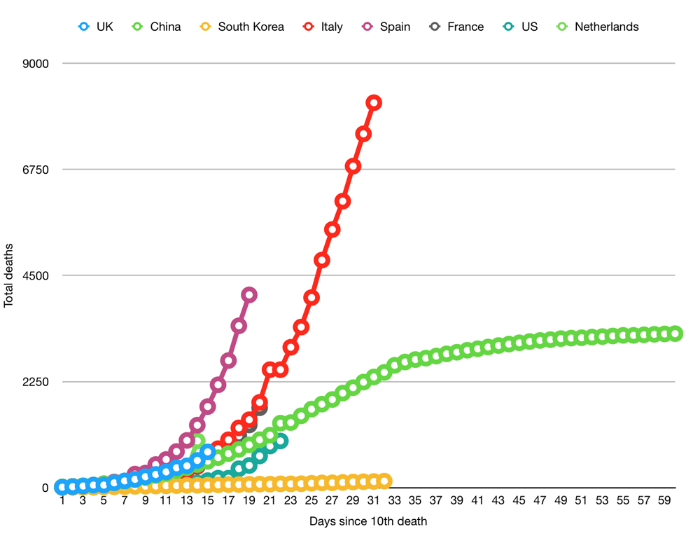
Huge variations in estimates mean that we are 25% of the way through this to 2% of the way through this. All of this underscores the desperate need to start wide-scale antibody testing so that we can make evidence-based decisions on how we fight coronavirus.
The number of people likely to die depends on two factors: how likely you are to die when you get it (IFR) and how many people you will spread it to (R0). Below, I’ll explain both of these and run the numbers based on current estimates.
How many people you will spread it to
R0 represents how many people an infectious person will give it to. With seasonal flu, this is typically around 1.3. With highly infectious disease, such as measles, this can be as high as 9. Anything below 1 is great because it means the disease will slowly disappear as anything less than 1 means you are not even passing it on to one other person.
The Lancet has given an early estimate that COVID-19 at 2.35. But other studies have suggested it could be as high as 5.7.
The amount of people you infect is also dependent on the percentage of the population that are vulnerable. If half the population is immune because they have already had it or because they have been vaccinated, you can divide R0 by two. The number of people you infect is actually R0 * percentage of the population that is vulnerable (R0S).
R0 is important for two reasons. First, the higher it is, the faster it will spread. We can artificially suppress the number to be lower by using things like social distancing and lockdowns. If we can get it down to 1 we can control the situation. This is easier to do at 2.35 than it is at 5.7. The problem with social distancing is that it only artificially suppresses the outcome. Once you end the social distancing, the number jumps back up and the whole process starts again.
Second, it defines the number of the population that need to be infected or vaccinated before the disease will start to disappear. At 2.35, we need around 60% of the population to be immune before the number drops below 1. At 5.7, that means 80% of the population.
How many people die from it
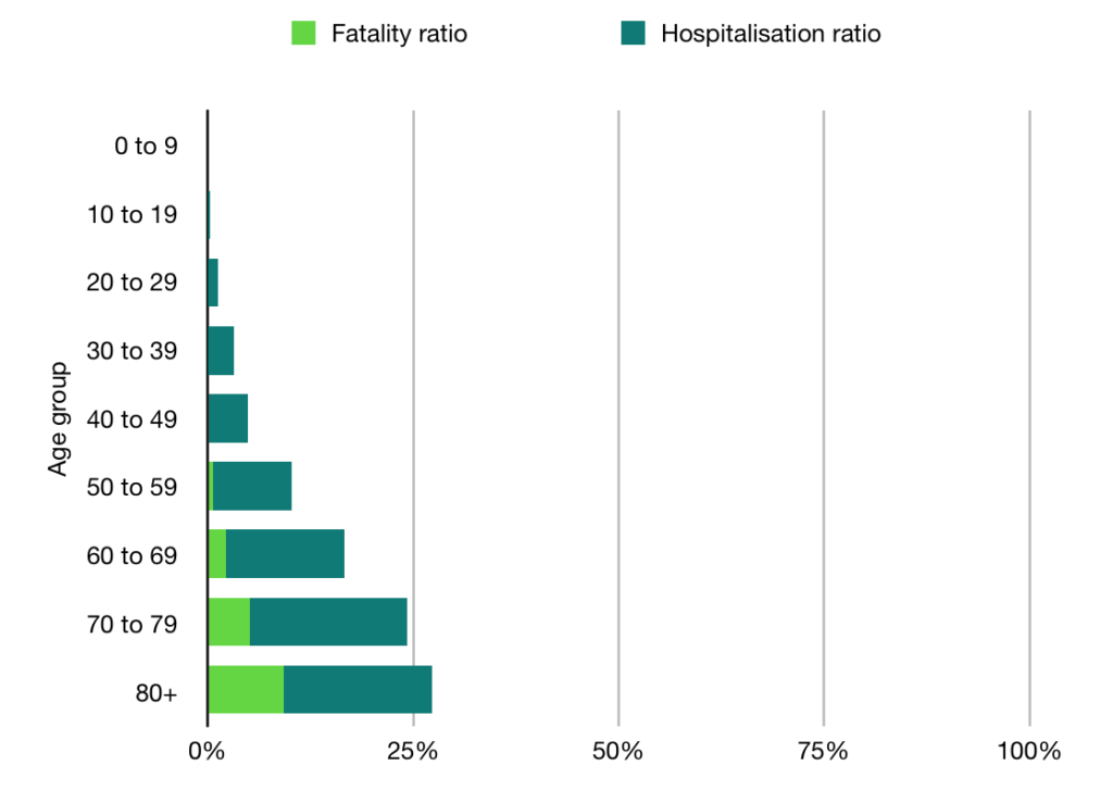
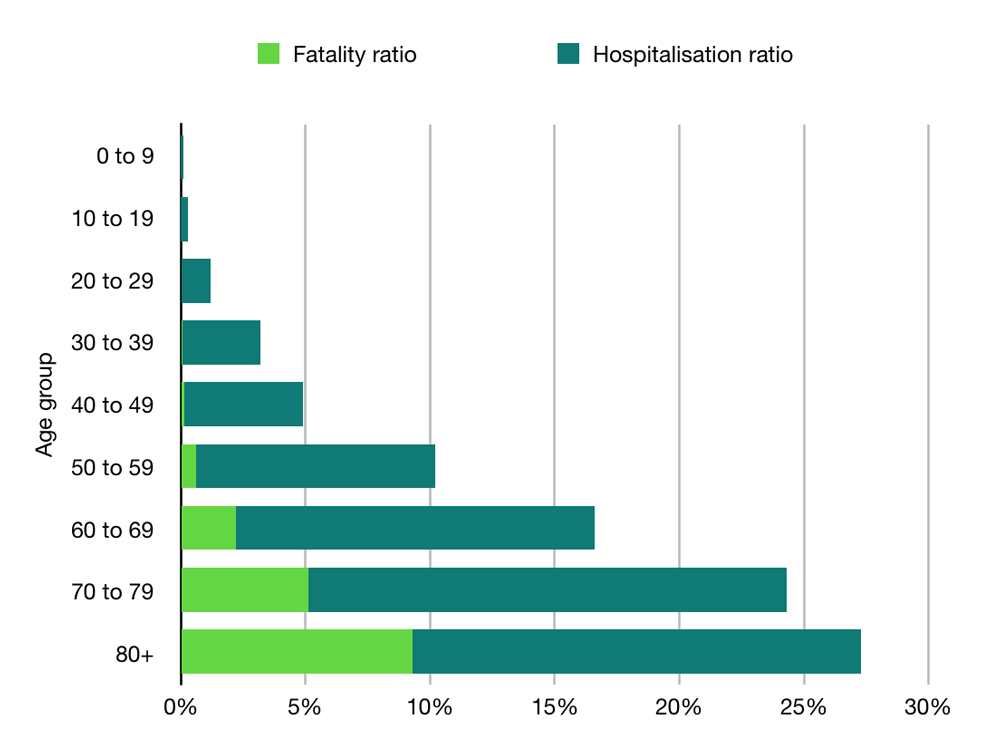
The second factor is how deadly the disease is. If you haven’t followed the coverage too deeply, you might think the death rate is anywhere up to 3.4%. But this is not the case. What you’re looking at here is the case fatality rate (CFR), which is the percentage of people who test positive and then die.
This is quite high in some countries that are not bothering to test anyone and quite low in countries that are widely testing. But nobody is pretending it is the infection fatality rate (IFR), which tells you of the people who get it (tested or not), how many of them die. This we can only poorly estimate because we haven’t tested enough people.
In the UK, we know we are missing a lot of people because we are only testing those admitted to hospital (plus Prince Charles), and the results from testing in Iceland suggest that 10-50% of people are asymptomatic.
Estimates on the IFR vary. In an article in The Lancet, Imperial put it as high as 0.66%. Oxford University, however, put the figure much lower, estimating it to be somewhere between 0.1% and 0.36%.
Combining the variables
Here is the data modelled at for both an R0 of roughly 2.36 (60% of the population required to develop immunity) and for 5.7 (80% of population).
Country
UK
Italy
Spain
France
Population
67,801,000
60,483,000
46,750,000
65,235,000
60% of population
40,680,600
36,289,800
28,050,000
39,141,000
Deaths at 0.1% IFR
40,681
36,290
28,050
39,141
Deaths at 0.36% IFR
146,450
130,643
100,980
140,908
Deaths at 0.66% IFR
268,492
239,513
185,130
258,331
80% of population
54,240,800
48,386,400
37,400,000
52,188,000
Deaths at 0.1% IFR
54,241
48,386
37,400
52,188
Deaths at 0.36% IFR
195,267
174,191
134,640
187,877
Deaths at 0.66% IFR
357,989
319,350
246,840
344,441
A few things should be noted: first, this only calculates the point at which the disease starts to disappear. It won’t disappear overnight. Even if we get R0S down to 0.8, that still means that if 10 people get it, they will infect another 8. It’s on it’s way out but it is still throwing a few punches.
Second, if you want to be an optimist, you could say the IFR could be even lower. In the early days of swine flu, we were talking about high death rates (1-2%) and, in the end, it turned out to be 0.02%. This makes sense from a psychological point-of-view. Much better for a researcher to overestimate and say “sorry, it wasn’t that deadly after all” than to fail to raise the alarm, let everyone die and say “sorry, turned out it was super dangerous and it’s my fault everyone is dead”.
Other exit strategies
There are two other ways this could end. One is that it magically goes away over summer. Trump is still hoping for this option, I think, but even if this did happen, it may well just come back next winter.
The other exit option is a vaccine. Experts have said this is still 18 months away (12 if everything went perfect). But, importantly, this is just to deliver the vaccine. There is a difference between developing the thing and embarking on a nationwide or worldwide immunisation campaign. We have PPE equipment and COVID-19 tests now, for example, but getting them to the people who need them is still a logistical nightmare taking months.
So, we’re probably looking at two years until we’re immunised. For this to save lives, we would have to artificially suppress R0S to less than 1 for that entire time, which means two years of varying degrees of lockdowns and social distancing.
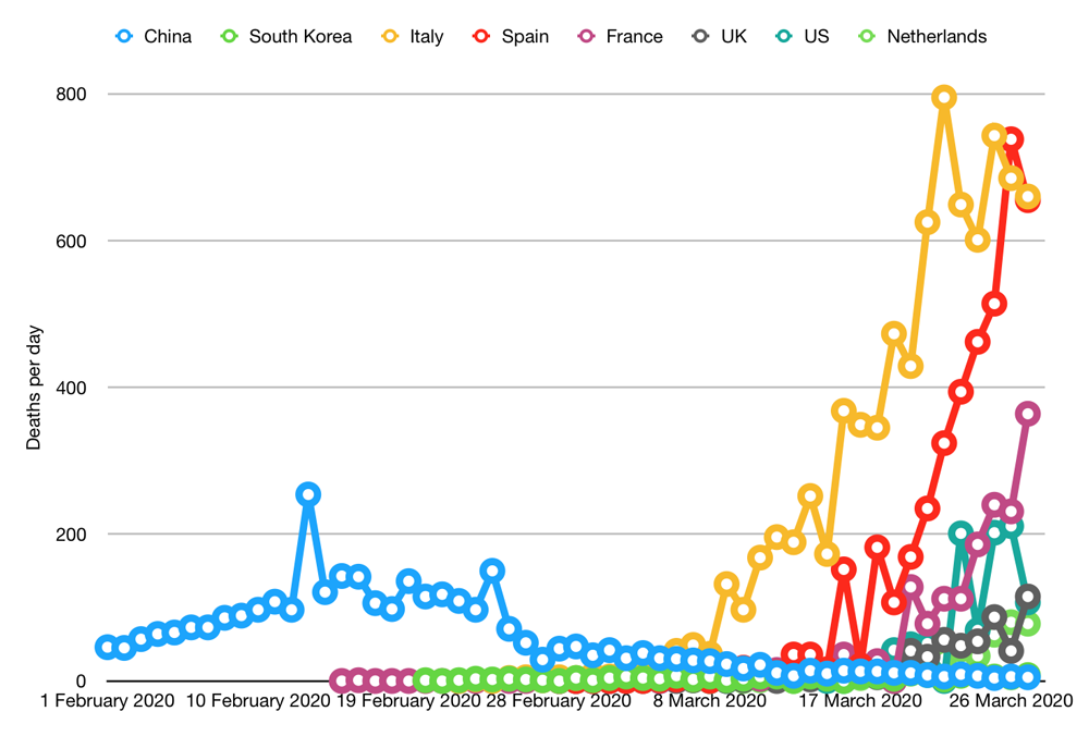
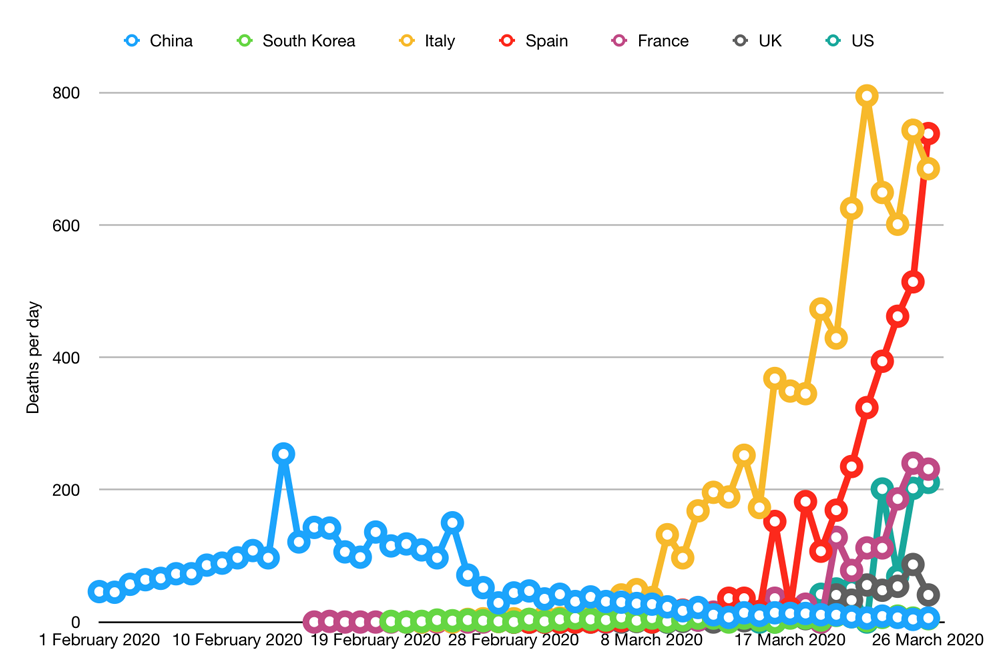
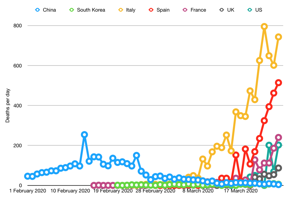
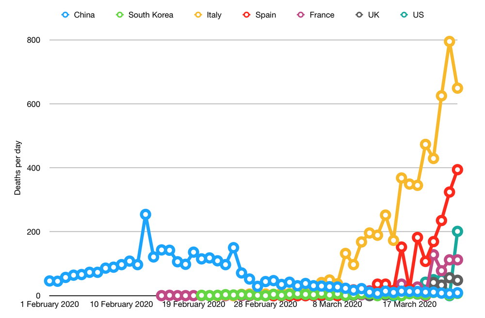
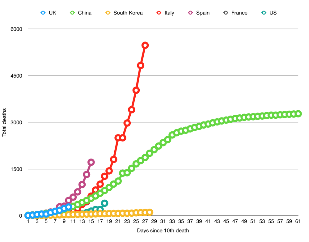
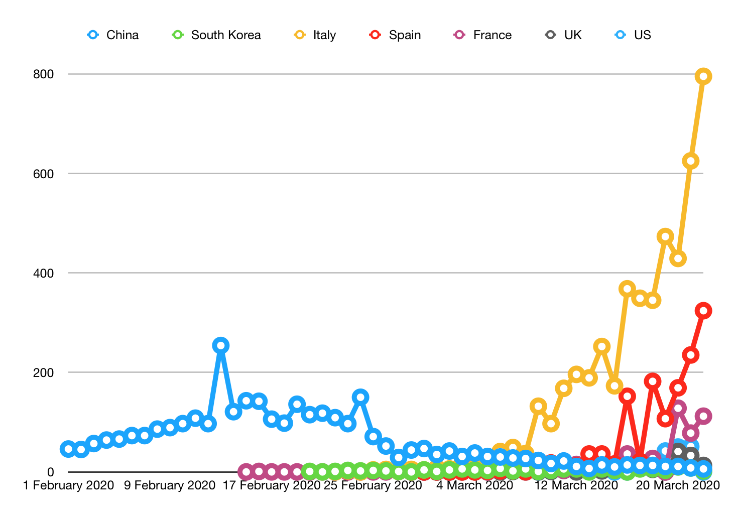
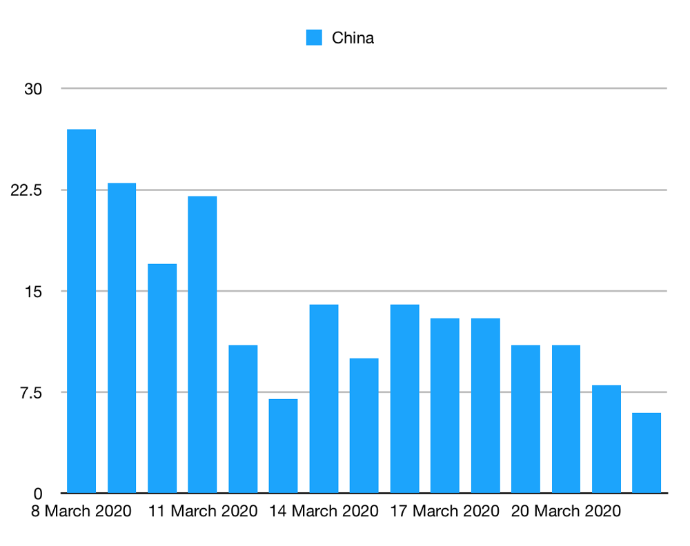
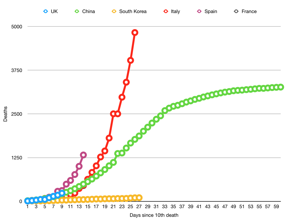
Whether this can work depends on how easy it is to suppress the virus. If South Korea continues to limit their deaths to a handful per day, they could keep the total number down to 2,000. New Zealand seem to be doing even better. How well this will work in the long-term is unclear; China is now battling a second wave of foreign infections, for example, and normal life is far from resumed in any of these countries.
Conclusion
Somewhere between 40,000 and 400,000 people in the UK are likely to die with COVID-19.
At the best-case scenario, we could be in for another three weeks of grim death counts before the virus starts to disappear forever.
In a worst-case scenario, we’re 2% into this, which will either see us go through a full year of this many deaths per day or a two-year-long lockdown while we hideout waiting for a vaccine. Neither of these options is appealing because it involves a lot of death, or in option B, two years of social isolation, mental health problems, suicides, drug and alcohol abuse, lack of a healthcare system, missed cancer screenings, job losses, domestic abuse, children not getting their education and the many other social costs.
All of this underscores the need to start large-scale antibody testing to confirm what the IFR is. Once we know that, we can start making evidence-based decisions about what the plan should be.
Huge variations in estimates mean that we are 25% of the way through this to 2% of the way through this. All of this underscores the desperate need to start wide-scale antibody testing so that we can make evidence-based decisions on how we fight coronavirus.
The number of people likely to die depends on two factors: how likely you are to die when you get it (IFR) and how many people you will spread it to (R0). Below, I’ll explain both of these and run the numbers based on current estimates.
How many people you will spread it to
R0 represents how many people an infectious person will give it to. With seasonal flu, this is typically around 1.3. With highly infectious disease, such as measles, this can be as high as 9. Anything below 1 is great because it means the disease will slowly disappear as anything less than 1 means you are not even passing it on to one other person.
The Lancet has given an early estimate that COVID-19 at 2.35. But other studies have suggested it could be as high as 5.7.
The amount of people you infect is also dependent on the percentage of the population that are vulnerable. If half the population is immune because they have already had it or because they have been vaccinated, you can divide R0 by two. The number of people you infect is actually R0 * percentage of the population that is vulnerable (R0S).
R0 is important for two reasons. First, the higher it is, the faster it will spread. We can artificially suppress the number to be lower by using things like social distancing and lockdowns. If we can get it down to 1 we can control the situation. This is easier to do at 2.35 than it is at 5.7. The problem with social distancing is that it only artificially suppresses the outcome. Once you end the social distancing, the number jumps back up and the whole process starts again.
Second, it defines the number of the population that need to be infected or vaccinated before the disease will start to disappear. At 2.35, we need around 60% of the population to be immune before the number drops below 1. At 5.7, that means 80% of the population.
How many people die from it
The second factor is how deadly the disease is. If you haven’t followed the coverage too deeply, you might think the death rate is anywhere up to 3.4%. But this is not the case. What you’re looking at here is the case fatality rate (CFR), which is the percentage of people who test positive and then die.
This is quite high in some countries that are not bothering to test anyone and quite low in countries that are widely testing. But nobody is pretending it is the infection fatality rate (IFR), which tells you of the people who get it (tested or not), how many of them die. This we can only poorly estimate because we haven’t tested enough people.
In the UK, we know we are missing a lot of people because we are only testing those admitted to hospital (plus Prince Charles), and the results from testing in Iceland suggest that 10-50% of people are asymptomatic.
Estimates on the IFR vary. In an article in The Lancet, Imperial put it as high as 0.66%. Oxford University, however, put the figure much lower, estimating it to be somewhere between 0.1% and 0.36%.
Combining the variables
Here is the data modelled at for both an R0 of roughly 2.36 (60% of the population required to develop immunity) and for 5.7 (80% of population).
| Country | UK | Italy | Spain | France |
|---|---|---|---|---|
| Population | 67,801,000 | 60,483,000 | 46,750,000 | 65,235,000 |
| 60% of population | 40,680,600 | 36,289,800 | 28,050,000 | 39,141,000 |
| Deaths at 0.1% IFR | 40,681 | 36,290 | 28,050 | 39,141 |
| Deaths at 0.36% IFR | 146,450 | 130,643 | 100,980 | 140,908 |
| Deaths at 0.66% IFR | 268,492 | 239,513 | 185,130 | 258,331 |
| 80% of population | 54,240,800 | 48,386,400 | 37,400,000 | 52,188,000 |
| Deaths at 0.1% IFR | 54,241 | 48,386 | 37,400 | 52,188 |
| Deaths at 0.36% IFR | 195,267 | 174,191 | 134,640 | 187,877 |
| Deaths at 0.66% IFR | 357,989 | 319,350 | 246,840 | 344,441 |
A few things should be noted: first, this only calculates the point at which the disease starts to disappear. It won’t disappear overnight. Even if we get R0S down to 0.8, that still means that if 10 people get it, they will infect another 8. It’s on it’s way out but it is still throwing a few punches.
Second, if you want to be an optimist, you could say the IFR could be even lower. In the early days of swine flu, we were talking about high death rates (1-2%) and, in the end, it turned out to be 0.02%. This makes sense from a psychological point-of-view. Much better for a researcher to overestimate and say “sorry, it wasn’t that deadly after all” than to fail to raise the alarm, let everyone die and say “sorry, turned out it was super dangerous and it’s my fault everyone is dead”.
Other exit strategies
There are two other ways this could end. One is that it magically goes away over summer. Trump is still hoping for this option, I think, but even if this did happen, it may well just come back next winter.
The other exit option is a vaccine. Experts have said this is still 18 months away (12 if everything went perfect). But, importantly, this is just to deliver the vaccine. There is a difference between developing the thing and embarking on a nationwide or worldwide immunisation campaign. We have PPE equipment and COVID-19 tests now, for example, but getting them to the people who need them is still a logistical nightmare taking months.
So, we’re probably looking at two years until we’re immunised. For this to save lives, we would have to artificially suppress R0S to less than 1 for that entire time, which means two years of varying degrees of lockdowns and social distancing.
Whether this can work depends on how easy it is to suppress the virus. If South Korea continues to limit their deaths to a handful per day, they could keep the total number down to 2,000. New Zealand seem to be doing even better. How well this will work in the long-term is unclear; China is now battling a second wave of foreign infections, for example, and normal life is far from resumed in any of these countries.
Conclusion
Somewhere between 40,000 and 400,000 people in the UK are likely to die with COVID-19.
At the best-case scenario, we could be in for another three weeks of grim death counts before the virus starts to disappear forever.
In a worst-case scenario, we’re 2% into this, which will either see us go through a full year of this many deaths per day or a two-year-long lockdown while we hideout waiting for a vaccine. Neither of these options is appealing because it involves a lot of death, or in option B, two years of social isolation, mental health problems, suicides, drug and alcohol abuse, lack of a healthcare system, missed cancer screenings, job losses, domestic abuse, children not getting their education and the many other social costs.
All of this underscores the need to start large-scale antibody testing to confirm what the IFR is. Once we know that, we can start making evidence-based decisions about what the plan should be.