Posts Tagged ‘advertising’

Facebook ad fails #6

Tuesday, October 30th, 2018 | Business & Marketing

Recently, I tried to set my targetting on a Facebook ad and the update failed. I didn’t notice and my ad went out to a much wider audience than intended. Luckily, this ended really well. But you’re not always that lucky.

Here are two examples of ads that (I presume) have missed their targeting.

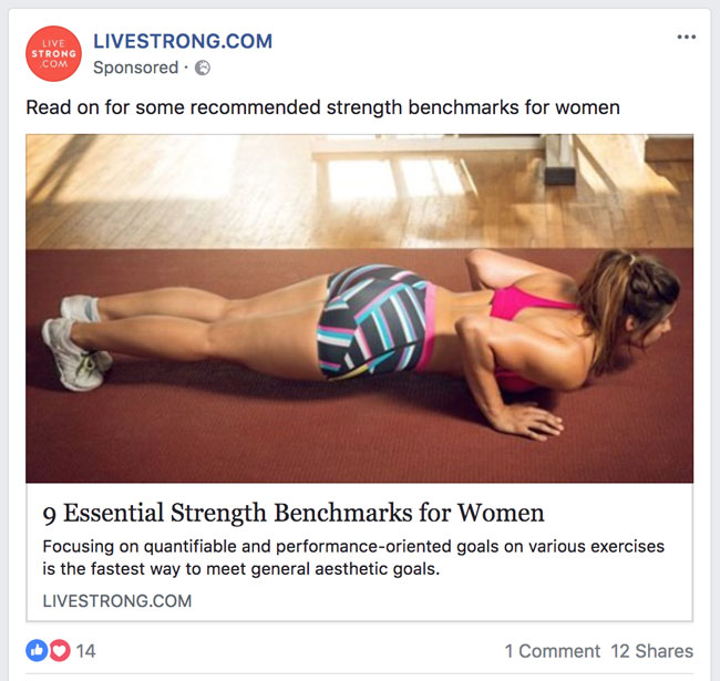
Here is a company selling tights. You would imagine that you would want to target these ads at women. Sure, you might want to sell to men as a gift for their partners. But you would write totally different ad copy for that.

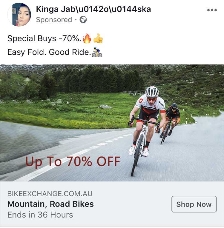
Here is another example. My guess is that it is a scam because of the username and 70% discount. But, even so, it’s advertising an Australian bike shop even though I’m in the UK.
Do take the time to set your targetting and to check that it is correct.
Facebook ad fails #5

Thursday, August 30th, 2018 | Business & Marketing

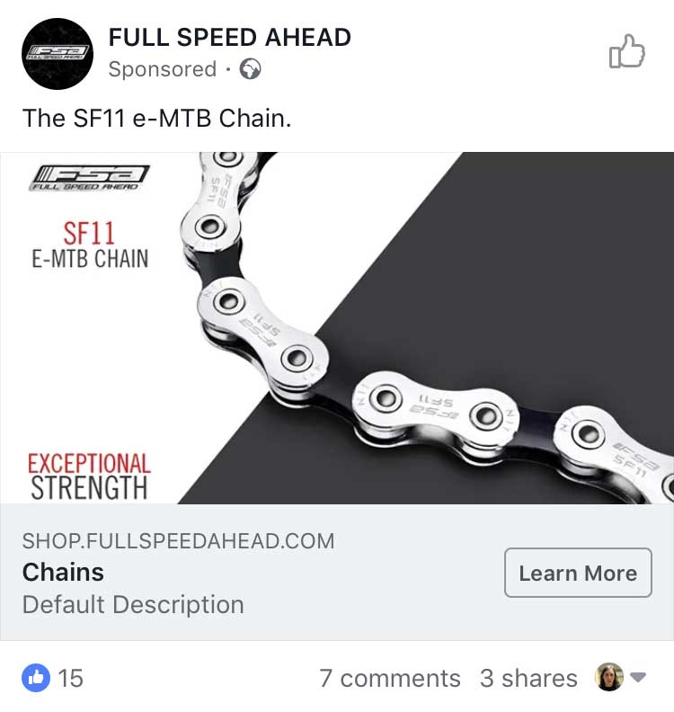
Here is someone selling a “Default Description” chain.

This one is an interesting one. You can see what they are getting out trying to pique your curiosity. But they don’t even hint at what it is. And it’s for both runners and people who go outdoors, so how specific or interesting can it be? I didn’t request their free download.

This company did include a description. But it’s mostly HTML tags.

This one isn’t an ad, but while we’re on the topic of including code, here is an Instant Article from The Independent.

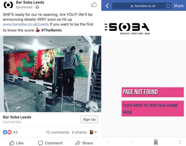
This advert for Bar Soba looks fine. However, as soon as you click it you get a “page not found” error on their website.

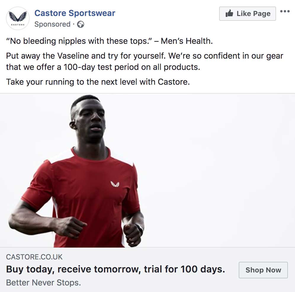
Castore’s Facebook ad

Wednesday, July 11th, 2018 | Business & Marketing

This advert popped up in my Facebook feed recently and I thought I would re-post it as it is an excellent example of an advert.

It’s great for two reasons. The first is that they pick a really specific pain point and promise to take that pain away. In this case, it’s literally a pain point: no more bleeding nipples.

If you’re a runner, which is their target audience, you will probably know how sore and painful your nipples get after a long run. And having to vaseline up. And forgetting to vaseline up and running along thinking “it’s just a matter of time until this gets unpleasant”. They promise to fix this problem.

They could have talked about loads of different things. The material is designed to keep you cool, to wick away sweat, dry quickly, etc. But they don’t get distracted by that. They keep it for separate adverts. They pick one specific point to get people hucked and then sell them on everything else later.

Second, it’s an excellent offer. Try it for 100 days and if you don’t like it, send it back. It takes all of the risk out of buying with them.

Facebook ad fails #4

Saturday, May 26th, 2018 | Business & Marketing

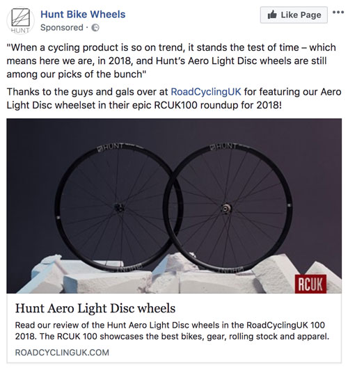
This week’s lesson on crafting a good Facebook ad is to make sure that your image matches your sales copy. Take a look at this advert from Hunt Bike Wheels.

This ad is just confusing because it’s talking about disc wheels, but the wheels in the photo are clearly not disc wheels.

Compare it to this disc wheel from Planet X:

You’ll notice that this one looks like a disc.

Now, you could argue that I have misunderstood, and they’re actually talking about wheels with brake discs on them. Which, from the look of their website, which features a lot of wheels with brake discs on them, is probably the case.

But there aren’t even any brake discs on the image in the advert. All of this causes a lot of confusion for the user who struggles to work out what they are looking at. To avoid this, make sure your image makes sense with your sales copy.

Facebook ad fails #3

Tuesday, May 15th, 2018 | Business & Marketing

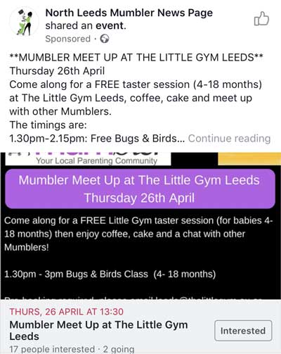
This week, I’m looking at a classic mistake people make when targetting their ads: not targetting it at the correct level of customer. To do it, I’m using this ad that popped up in my newsfeed.

Here’s what I don’t like about it: I have no idea what a “mumbler” is.

At first, I thought it was some kind of speech impediment group. I’ve got a lot of friends who have come through the McGuire Programme, which helps with stammers, so I assumed it was something similar at first glance.

But then it mentions babies, so I’m wondering whether it’s a mum’s group.

None of what they are doing makes any sense.

First, why am I seeing this? They could set the targeting to be people who have interacted with their page or visited their website, in which case it makes sense to go straight into your sales copy without explaining what your group is.

Or, if it’s a general ad, they need to explain what it is. Think of Eugene Schwartz’s levels of awareness. They need to tell me what their group is.

If it is a mums group, why am I seeing it? I’m a dad. They can set gender targetting on the ad to just include mums, or they could have a separate version of the ad, targetted at men, which makes it clear that dads are welcome too.

Conclusion

I’ve written before about how community groups should not use Facebook ads. Do it if you know what you’re doing. But you probably don’t know how to write copy or set the targeting, so you’re probably wasting your money. This ad is a good example of that.

If you do want to use Facebook ads, then make sure you know how to target your ads appropriately and come up with relevant ads for each audience segment.

Facebook ad fail of the week

Thursday, April 19th, 2018 | Business & Marketing

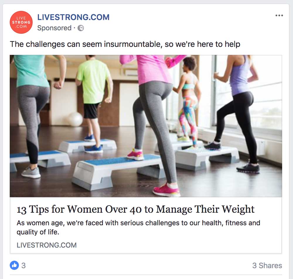
Live Strong is back with a new ad this week. They’re not suggesting I’m over 40 this week, but it still seems a strange use of your advertising budget to show me this.

More advertising fails

Saturday, March 31st, 2018 | Business & Marketing

Last month, I wrote about people wasting money on advertising. I said it happens a lot: and it does. Here are two more examples I found this month.

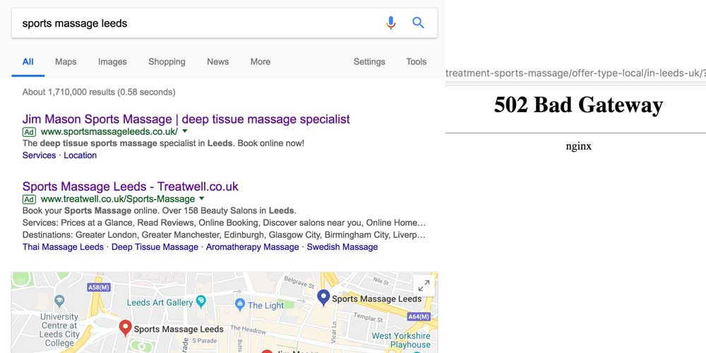
First, here is a Google AdWords advert by Treatwell. Except the page does not work.

And here is an advert from Live Strong. The link does work: it takes you to the article on tips for women over a 40. Bear in mind that you put the targeting parameters in when you create a Facebook ad. Facebook knows I a man under 40, so they could easily exclude me from seeing an ad I obviously have no interest it.

Facebook ad fails

Thursday, February 22nd, 2018 | Business & Marketing

Facebook ads cost money. Therefore, if you’re running them, you want to make sure they are converting. Rule one of this process is to make sure the links worth. It sounds obvious, but these people seem to have missed it.

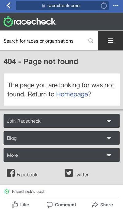
Here is an advert by RaceCheck that produces a 404:

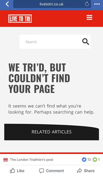
A funny one-off, you might think. But you would be incorrect. I see this kind of thing all the time. Here is an advert by Live To Tri that does the same thing:

By the way, if you ever wanted proof that people will interact with a Facebook post without actually clicking on it, notice that 12 people have liked an ad that does not work.

Here is another advert fail. Facebook allows us to target age. So, they know that I was not born before 1985. Why would they target someone born after 1985 with this ad?

Maybe it is some kind of clever tactic that makes people click out of anger? I’m not sure. But I didn’t click.

If you’re spending money on Facebook advertising, it is worth checking whether the links work. Otherwise, you are literally throwing money away.

Sportive Breaks ad

Tuesday, December 19th, 2017 | Business & Marketing

If you are interested in great advertising, take a look at this. The best hit potential customers with a specific pain point and promise to fix it. Which is exactly what this advert from Sportive Breaks does. It was freezing this morning and I would much rather be cycling on Mallorca.

The Wizard of Ads

Saturday, August 12th, 2017 | Books

The Wizard of Ads: Turning Words into Magic and Dreamers into Millionaires is a book by Roy H. Williams.

My current series of blog posts is a clearing out and putting to bed of all the books I have half-finished. Typically, when I start a book, I finish it. But Napoleon’s Hill’s Think and Grow Rich has inspired me to give up on a bad book.

The Wizard of Ads is somewhat more interesting. But the trouble is that I have now read most of it and I am still not sure what it is about. I think it is about marketing and advertising. But the author jumps around so much that it is almost impossible to follow his chain of thought.

Indeed, there may be done. There is no real structure to the book. It is a collection of anecdotes that Williams thinks will be useful to marketers.

And they are. There is a lot of gems to be gleaned from this book. Including:

  • People are always thinking: get their attention by giving them someone more interesting.
  • Don’t train your customers to wait for a sale
  • Tell a customer what they already know or suspect. They will believe you.
  • Save people time, not money.
  • Great presentation will cause people to buy emotionally.
  • Make people feel good, don’t point out problems.

But the lack of structure of clear theme to the book making the whole thing rambling and confusing. The religious references also get tedious.

The most controversial aspect of the book is probably that Williams rejects targeting and sales it is all in the copy. This goes against what most marketers teach. Indeed, it even goes against what Gary Halbert teaches in The Boron Letters: “more than anything, give me a list of qualified buyers”.

It does have a fun title, though.