This week’s lesson on crafting a good Facebook ad is to make sure that your image matches your sales copy. Take a look at this advert from Hunt Bike Wheels.

This ad is just confusing because it’s talking about disc wheels, but the wheels in the photo are clearly not disc wheels.
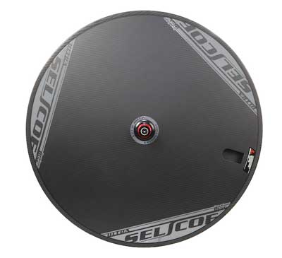
Compare it to this disc wheel from Planet X:

You’ll notice that this one looks like a disc.
Now, you could argue that I have misunderstood, and they’re actually talking about wheels with brake discs on them. Which, from the look of their website, which features a lot of wheels with brake discs on them, is probably the case.
But there aren’t even any brake discs on the image in the advert. All of this causes a lot of confusion for the user who struggles to work out what they are looking at. To avoid this, make sure your image makes sense with your sales copy.
Don't have time to check my blog? Get a weekly email with all the new posts. This is my personal blog, so obviously it is 100% spam free.
Tags: ad fails, advertising, facebook, Facebook ads, online advertising
This entry was posted on Saturday, May 26th, 2018 at 11:00 am and is filed under Business & Marketing. You can follow any responses to this entry through the RSS 2.0 feed. Both comments and pings are currently closed.