Mobile-first navigation
Thursday, August 17th, 2017 | Programming
If you have a website, it is not enough to talk about “mobile-first design” anymore. We need to talk about mobile-first navigation, too.
The days of desktop computer terminals are gone. They’re not going anywhere, but most internet access is on a mobile device today. And has been for four years. We all design websites on these big laptop screens, but that isn’t how anybody else is looking at it.
So, we all started adopting mobile-first design.
You make the website look brilliant on a mobile, then re-arrange everything with CSS media queries so that it looks good on a desktop, too. Some people did it because they wanted to offer their users the best experience they could, others because Google announced they would be demoting sites that were not mobile friendly.
What about navigation, though?
Pages that you can read on a mobile device are a big improvement. But we forgot about navigation.
Take a look at The Washington Post’s website:

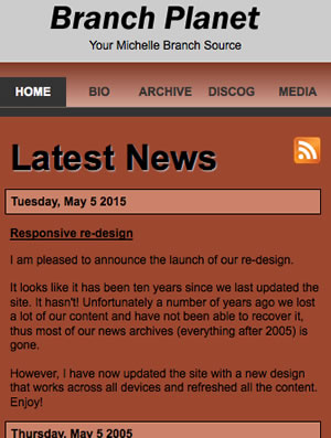
They have put a hamburger menu icon in the top left. Which is what a lot of websites do.
What’s wrong with this? It puts the menu icon in the on exact place that the majority of users cannot reach with their thumb:

Not great then.
Recently, though, there has been a move to clamp down on this. The UX community has begun to beat the drum of mobile-first navigation. Which is a good thing, because it is about time.
Thinking mobile-first
While web designers have been slow to adapt, app designers have not. Because they actually apps, no doubt. Take a look at most of them and you will see the navigation is on the bottom. Where your thumb is.
Here is the Facebook app, for example:

The NHS’s Change4Life website has embraced this principle, too. On the desktop, you get the navigation at the top:

But when you shrink your device to mobile size, the navigation fixes itself to the bottom:

Welcome to a much better world.
If you have a website, it is not enough to talk about “mobile-first design” anymore. We need to talk about mobile-first navigation, too.
The days of desktop computer terminals are gone. They’re not going anywhere, but most internet access is on a mobile device today. And has been for four years. We all design websites on these big laptop screens, but that isn’t how anybody else is looking at it.
So, we all started adopting mobile-first design.
You make the website look brilliant on a mobile, then re-arrange everything with CSS media queries so that it looks good on a desktop, too. Some people did it because they wanted to offer their users the best experience they could, others because Google announced they would be demoting sites that were not mobile friendly.
What about navigation, though?
Pages that you can read on a mobile device are a big improvement. But we forgot about navigation.
Take a look at The Washington Post’s website:
They have put a hamburger menu icon in the top left. Which is what a lot of websites do.
What’s wrong with this? It puts the menu icon in the on exact place that the majority of users cannot reach with their thumb:
Not great then.
Recently, though, there has been a move to clamp down on this. The UX community has begun to beat the drum of mobile-first navigation. Which is a good thing, because it is about time.
Thinking mobile-first
While web designers have been slow to adapt, app designers have not. Because they actually apps, no doubt. Take a look at most of them and you will see the navigation is on the bottom. Where your thumb is.
Here is the Facebook app, for example:
The NHS’s Change4Life website has embraced this principle, too. On the desktop, you get the navigation at the top:
But when you shrink your device to mobile size, the navigation fixes itself to the bottom:
Welcome to a much better world.