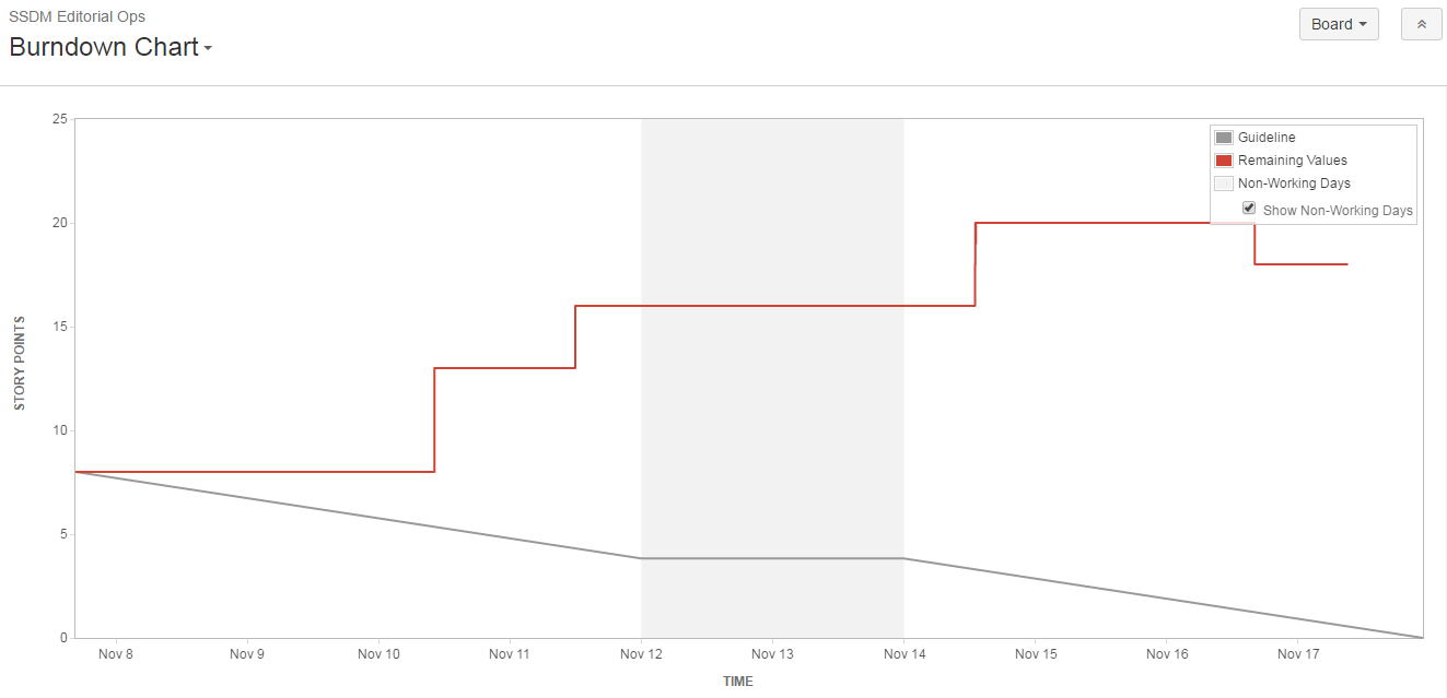
If you are not familiar with a burndown chart, the idea is this: you pull so many points (bits of work) into a sprint (a period of time, typically two weeks) and your burndown chart shows you how far you are through said work. So, the red line on the chart (the amount of work done) should follow the grey line.
Or, at worst case scenario, the red line should stay flat because you have done literally nothing.
However, what it should never, ever do is go in the opposite direction to the grey line. Because that would mean you actually ended the sprint with more work to do than you had at the start of it. The point of a sprint is that you should not be bringing in extra tasks.
Safe to say then, that this was not a great sprint for us. But, it is at least comically bad.

Don't have time to check my blog? Get a weekly email with all the new posts. This is my personal blog, so obviously it is 100% spam free.
Tags: agile, burndown, scrum, sprint
This entry was posted on Wednesday, February 1st, 2017 at 10:26 am and is filed under Tech. You can follow any responses to this entry through the RSS 2.0 feed. Both comments and pings are currently closed.