Posts Tagged ‘statistics’

Cadbury Dairy Milk Mixed Buttons research

Sunday, April 26th, 2020 | Science

Cadbury produces a sharing bag of mixed chocolate buttons containing both milk and white buttons. As soon as you learn this exists you are probably thinking “are there equal numbers of each button in the bag?”

Do not worry. I have painstaking done the research. For months I have been analysing the frequency of each type of button in each bag to work out what the balance is. Finally, my research is ready to publish.

Here are the results:

A paired samples t-test to compare the number of milk and white buttons in each bag. There were more milk buttons (M = 55.38, SD = 1.30) than white buttons (M = 45.38, SD = 1.30).

Test for normality was run (p = 0.327) so Wilxin signed-rank was used (N = 8,

What kind of food does Leeds eat?

Wednesday, December 23rd, 2015 | Food

Following on from my previous post looking at statistics we can pull out from the Leeds Restaurant Guide dataset, I wanted to look at how the restaurant scene has changed since we first published the guide.

Here it is:

chart_cuisine_per_edition

In this graph, I have plotted each cuisine type against the number of restaurants. This is shown for the 1st edition (2013), 3rd edition (2014) and 5th edition (2015). As we learned in the last post, the number of restaurants has risen, so in general, we would expect most categories to have grown between each addition. I have not included pub grub as the size of it makes the rest of the data difficult to see.

For the most part, this holds true. Some cuisines have grown faster than others though. We have seen a rise in restaurants serving American, British, International (those that serve food from all over the world with no real speciality) and steak.

In other areas we have seen a decline though. Buffet, French, Indian and seafood have all seen a decline. Persian has too, but this was always a small market. The biggest change is possibly Chinese restaurants. In the first edition we had seven Chinese restaurants, now we have only four.

In terms of the most popular cuisines, Italian remains king. When we first wrote the guide we even considered splitting Italian into two categories, one for general Italian and one for restaurants that specifically did pizza. Latin is also very popular thanks to the growth of tapas bars. It used to be equally as popular as Indian, but Indian has since fallen away.

We can draw the most popular cuisines in a table. I have omitted hotels and casinos, and international because these do not really tell us anything about people’s tastes.

Position 2013 2015
1 Italian Italian
2 Latin Latin
3 Indian British
4 British American
5 American Indian

It is a pretty consistent story. The only change is that Indian has dropped off from a joint-second spot in 2013 to now being 5th, behind British and American. Much of the growth in these categories is down to meat places such as burgers and BBQ so it could be people are looking towards more meat-heavily dishes in recent years. Or it could also just be random chance. The sample size is not that big after all.

Leeds restaurants in numbers

Tuesday, December 22nd, 2015 | Food

Earlier this month I launched the 5th edition of the Leeds Restaurant Guide. Now, with five editions behind us and several years of data, I decided it would be interesting to see what we could mine from that information.

Number of restaurants

You might expect the number of restaurants in Leeds to be going up. It is, but only slightly.chart_restaurant_count

This graph shows the total number of restaurants. Over the past two and a half years the number of restaurants has increased 10%. These are not the same restaurants though. It is a case of them opening faster than they are closing.

chart_additions_closures

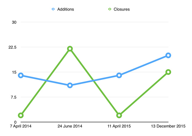
This graph shows the number of new restaurants opening and old restaurants closing between each edition. Restaurants have consistently opened while closures have been more sporadic. It is worth noting though that the release of each edition of the guide has not been equally spaced, even though it is shown this way on the graph, so that distorts the picture somewhat.

How we rate

Most restaurants are likely to be middle-of-the-road, with some not so good restaurants, some very good restaurants, and a few poor and excellent restaurants at either ends. So what happens when you plot frequency against rating?

chart_ratings_count

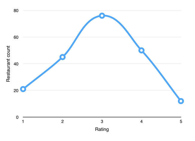
Ah, just what we wanted: a beautiful bell curve! Two is a little low for a perfect curve, but normal distributions are often imperfect in the real world. This suggests to me that our ratings are consistent with what you would expect from restaurants running in the free market.

That only shows data from restaurants that are still open. What about restaurants that have closed?

chart_ratings_closures

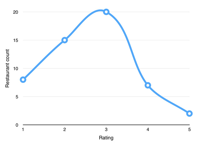
What we would expect to see here is a little less clear. Perhaps that 1-rating is the highest as poor restaurants should close the most. But given there are some many 3-rating restaurants, this might not be the case, and you may have to adjust it for frequency to see such a result. As it is we have another bell curve.

There is a clear asymmetry in the graph though. Far more 1-rating restaurants close than 5-rating restaurants, and far more 2-rating restaurants close than 4-rating restaurants, indicating that our ratings are broadly consistent with where the market chooses to spend, or not spend, it’s money.

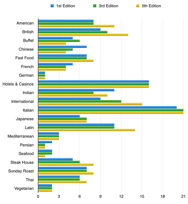
What type of food is the best?

What cuisine produces the highest standards? Can you provide any correlation between the type of food and how good a restaurant is?

chart_ratings_by_cuisine

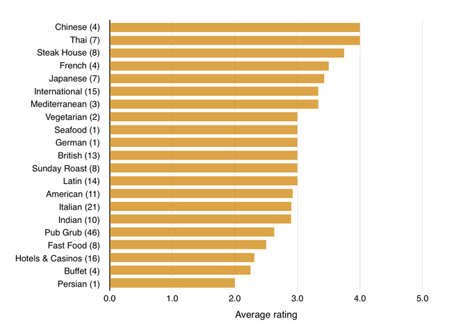
This graph shows each cuisine type and the average rating it receives. No category can maintain an average rating lower than 2 or higher than 4 because no range of restaurants can be that consistent.

I was not surprised to see Thai so high up. Steakhouses are also typically on the higher price range, so score well (though we do factor in price to an extent when awarding ratings). Chinese scoring to high is mostly a result of the less nice Chinese restaurants closing down.

The number in brackets after each cuisine indicates the number of restaurants in that category. So the ratings for Persian, German and seafood are pretty meaningless because it is based on a single restaurant.

What useful information we can draw from this is less clear. Just because the average restaurant scores well or poorly does not mean that all restaurants will. There are bad Thai restaurants for example (actually, there aren’t, but there used to be one) and good Indians (lots of them!). However, if you were to avoid eating at new hotels, casinos, fast food and pubs based on it being unlikely to be a good meal, few people would fault you for that.

Optimal Cupid

Thursday, November 5th, 2015 | Books

Optimal Cupid: Mastering the Hidden Logic of OkCupid is a book by Christopher McKinlay analysing the online dating site OkCupid.

He scraped the site to get data on thousands of profiles and then analysed the data so that he could build the ideal profile. He claims it worked for him, going on 88 dates in three months and is now engaged.

That is all very interesting, although it was not what I was hoping for when I read the book. I bought it thinking it would be an interesting insight into OkCupid, how they do stuff and what interesting information we can glean from a large dataset. That’s not the case at all, it is simply an analysis from a user’s perspective.

It is also a very short book. I polished the whole thing off one evening as a bit of light reading in bed. It will take you maybe an hour, maybe only half to finish it and I have no idea who the foreword is written by, but it feels like he just asked a friend to write a two page ramble.

Therefore I would not recommend the book to anyone, unless finding dates on OkCupid is your last salvation for happiness.

I did apply some of the ideas he suggested to my own OkCupid profile however, so it will be interesting to see if anything comes of it. Seems unlikely though given my profile is very clear that I am happy married and only interested in platonic friendship…

optimal-cupid

World Cup sticker book

Friday, June 20th, 2014 | Sport

How long would it take you to complete the World Cup sticker book?

The answer, as it turns out, is a long time. We did the maths in the office a few weeks ago and the value we came up with was £460. That is how much you need to spend on stickers, on average, to fill the entire book. This assumes a random distribution of each sticker with no rares.

James Offer has created an online tool which simulates the process. It opens up a random pack of stickers over and over again until you have filled the book. It reached 637 somewhere between £300-400 I think, then was still going for that last sticker at £600 when I turned it off after two hours.

Of course you can reduce this by having friends to swap with. However, as a 27 year old man, I do not know any of my friends that are collecting World Cup stickers (nor I am for the record).

The Signal and the Noise

Tuesday, March 25th, 2014 | Books

Nate Silver is the man who correctly predicted 51 of the 52 states in the 2008 US Presidential Election, and then all 52 in the 2012 election.

With an increasing number of people recommending I read his book “The Signal and the Nose”, I decided to give it a read. It looks at why we, as a society, are pretty bad at making predictions. Why did nobody see the 2008 financial crisis coming? Why is our best guess at when the next earthquake will hit no better than random chance? Why can’t we even predict if it will rain or not?

Actually, the last one, we can. Weather forecasts have become far more accurate over the last few decades. However, they are one of the few fields in which the large scale application of data and computing power to process that data has truly been effective.

Silver claims that one of the biggest problems is that as we now live in the “information age”, there is simply too much data to work out what is actually a useful predictor (the signal) and what is merely correlated (the noise). A great example of this is that the Super Bowl winner (AFC or NFC) was an accurate predictor of how the economy would do. But obviously that is just random chance and has proved erroneous in the past few years.

Ultimately the book has a simple message – you need to use a Bayesian model and apply regression. None of this is a new concept to me, nor indeed you would hope anyone working in the field of statistics. But judging by some of the meetings I have had recently, it is shocking the amount of people that do not follow this advice.

the-signal-and-the-noise

A Skeptical Look at Statistics

Friday, December 6th, 2013 | Foundation, Humanism

Last month John Fletcher presented a talk entitled “A Skeptical Look at Statistics” at Leeds Skeptics. It was great to see people there who were really interested in stats. It was also the first event we have held at the Hedley Verity and while it isn’t perfect, it is certainly an acceptable backup venue.

IMG_3109 IMG_3110 IMG_3113

Nonverbal communication

Friday, April 5th, 2013 | Public Speaking

Have you ever been told that only 7% of communication is verbal? The other 93% is not about the words you say, but the body language, tone and gestures that accompany it.

Incredible isn’t it? Almost too incredible. Indeed, there is a reason that it feels too incredible to be true – because it isn’t true. It’s a statistic based on the work by Albert Mehrabian at the University of California, which you can read all about on Wikipedia, that tests how people feel towards the speaker. But it doesn’t accurately translate into what percentage of your message is verbal or nonverbal.

Mehrabian states this on his website:

“Total Liking = 7% Verbal Liking + 38% Vocal Liking + 55% Facial Liking. Please note that this and other equations regarding relative importance of verbal and nonverbal messages were derived from experiments dealing with communications of feelings and attitudes (i.e., like–dislike). Unless a communicator is talking about their feelings or attitudes, these equations are not applicable. Also see references 286 and 305 in Silent Messages – these are the original sources of my findings.”

And has previously said in an email that was reproduced in the book Lend Me Your Ears:

“I am obviously uncomfortable about misquotes of my work. From the very beginning I have tried to give people the correct limitations of my findings. Unfortunately, the field of self-styled ‘corporate-image consultants’ or ‘leadership consultants’ has numerous practitioners with very little psychological expertise.”

Of course body language and vocal variety are an important part of communication. But the words you actually say do count for something too.

Leeds – Second biggest city in the UK

Monday, March 26th, 2012 | Distractions, Religion & Politics

One topic that often comes up in discussions is regarding how big Leeds is. So I thought I would clarify the situation, by pointing out that we are in fact the second biggest city in the UK.

Leeds now has a population of 810,200. That isn’t the West Yorkshire Urban Area which includes all the surrounding towns, of which the population is 1,499,465. So we’re not talking about Greater Leeds if you will, just Leeds.

Compare this to Glasgow, which has a population of 629,501, or Manchester, which has a population of 394,269. Of course, Greater Manchester has over two million people, but as we’ve already discussed, we’re not including surrounding towns.

Only one city can out-match us for population – and that is Birmingham, with a population of 970,892.

What of that London place you say? Why the City of London is only a square mile, and has a population of 11,700.

Gluttons for punishment

Sunday, June 27th, 2010 | Tech

There was a really interesting poll on SitePoint today asking whether freelance web developers were working this weekend. The results were as follows:

  • 43% said they always worked weekends
  • 34% said they sometimes worked weekends
  • 20% said they worked weekends if necessary
  • Only 3% said they never worked weekends

What we can probably assume from this is that on any given weekend, more than half of people who do freelance web development are working. Crazy people. Anyway, I would love to chat more about this but I have code to write…