Chris Worfolk's Blog


Whitby

September 22nd, 2017 | Life

In August, Elina’s mum flew in for a visit. Venla definitely enjoyed her visit.

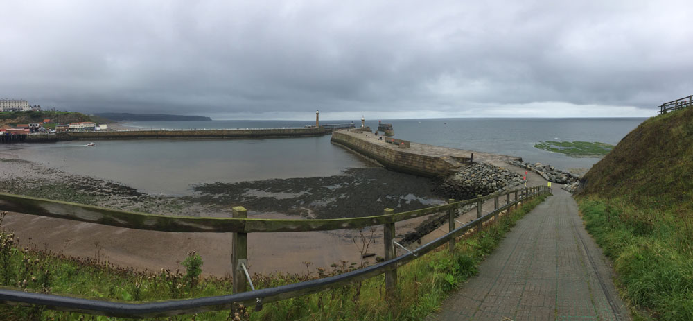
With only one spare day, we decided to head out to Whitby. This was a mixed bag. Due to the traffic, it took us nearly three hours to get there. And, when we did, it rained and there was nowhere to sit down. But, counting our blessings, we did at least avoid a parking fine despite forgetting to buy a ticket.

I was exhausted by the end of the day. So, we decided to let Venla drive home.

Illallinen taivaan alla

September 21st, 2017 | Events

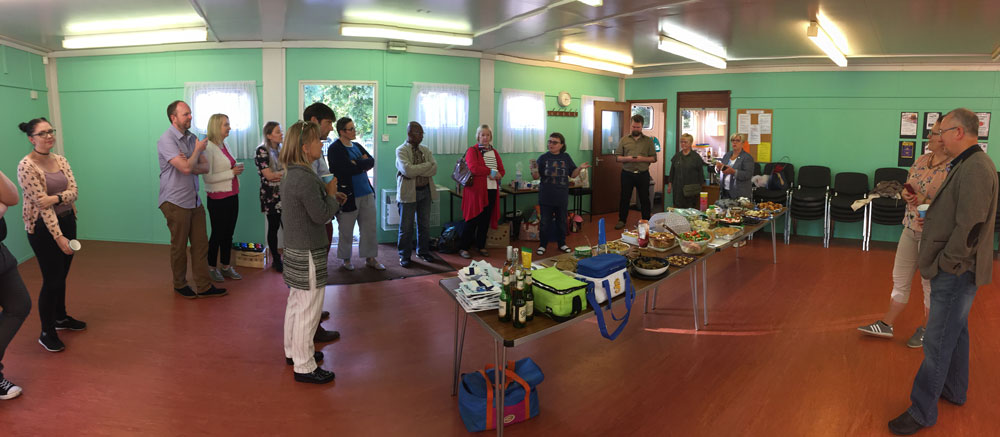
Finland turns 100 this year. In celebration, events are taking place around the world. They’re called Illallinen taivaan alla or “Dinner under the sky”. Tiina organised a Leeds event which was a big success.

There was loads of Finnish food, including a selection of cake so big that I don’t think I managed to get around everything. Despite trying really hard.

Gran’s 90th birthday

September 20th, 2017 | Family & Parenting

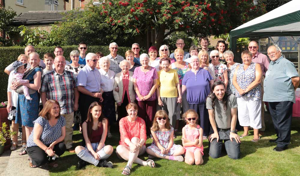
Last month, we celebrated my Gran’s 90th birthday with a family party. Much like the family party we had two years ago, we were once again blessed with good weather. And excellent company, of course.

Four tools to make your website more accessible

August 25th, 2017 | Tech

Making your website accessible people who are visually impaired isn’t sexy or glamorous. But it is pretty easy. And given how prevalent visual impairment is, especially among the elderly (which, all e-commerce operators should note are the people with all the money), it is time well spent.

Here are four tools that will help you tune up your website.

W3 HTML validator

Assistive technology is already out there helping people. All you have to do is provide it with the correct input. And that starts with following HTML standards. And, where possible, using semantic HTML5 tags.

These work in everything except Internet Explorer 8 and the number of users who make use IE8 is now lower than the percentage of people with visual impairment. Plus, it’s very easy to add backward compatibility in.

Once you have done this, run it through W3’s HTML validator tool. This will check that your code makes sense and so everyone’s browsers (visually impaired or not) will be able to read it correctly.

Click here to go to the W3 Validator.

WAVE
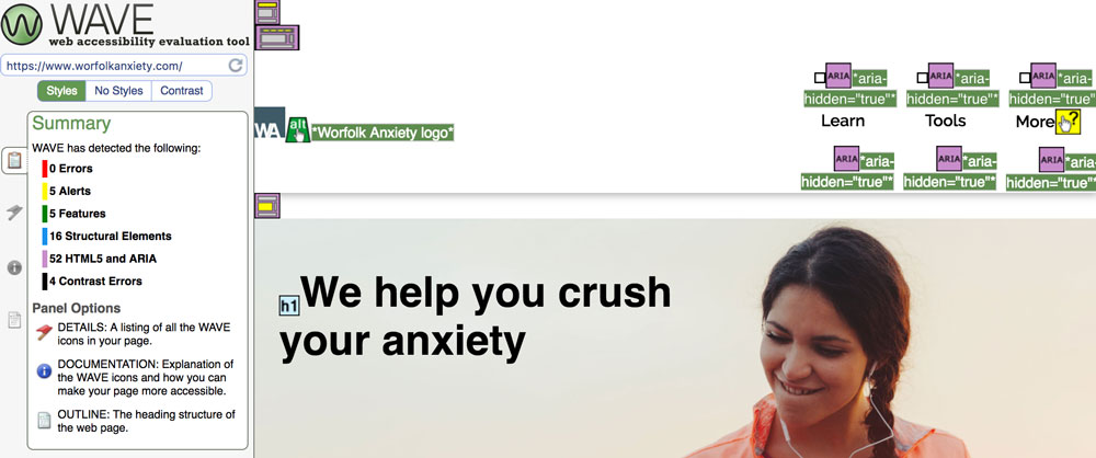
WAVE stands for the Web Accessibility Evaluation Tool. It’s an online tool that has been running since 2001 and is considered one of the best ways to test how accessible your website is.

All you have to do is enter the URL of your website and WAVE will give you a full report, including helpful suggestions and things to fix. You get a copy of your page highlighted with the information to make it easy to find.

Like everything on this list, it’s free.

Click here to access the tool.

a11y.css

This is a bookmarklet that scans your page for problems. If you are not familiar with a bookmarklet, it is a magic bookmark: you save it to your favourites and then when you click it, it will run the report on the current web page you are browsing.

It highlights areas of the page with possible errors that you can then review. It’s quick and simple to use but doesn’t offer as much depth as WAVE.

Click here to check it out.

MDN documentation

The Mozilla Developer Network is the de facto authority on how HTML works. This includes documentation on the ARIA standard, which is a standard designed to make web applications more accessible.

Even Mozilla’s documentation is rather hard to penetrate, but if you bare with it, you can get your head around it.

Click here to read the ARIA documentation.

Summary

Making your website accessible is pretty easy: it’s all about following standards and best practice, and maybe adding a few HTML attributes if you have code doing fancy things.

Doing so makes your website much easier to access for the visually impaired, which will mean a better world for them and more traffic for you.

Mobile-first navigation

August 17th, 2017 | Programming

If you have a website, it is not enough to talk about “mobile-first design” anymore. We need to talk about mobile-first navigation, too.

The days of desktop computer terminals are gone. They’re not going anywhere, but most internet access is on a mobile device today. And has been for four years. We all design websites on these big laptop screens, but that isn’t how anybody else is looking at it.

So, we all started adopting mobile-first design.

You make the website look brilliant on a mobile, then re-arrange everything with CSS media queries so that it looks good on a desktop, too. Some people did it because they wanted to offer their users the best experience they could, others because Google announced they would be demoting sites that were not mobile friendly.

What about navigation, though?

Pages that you can read on a mobile device are a big improvement. But we forgot about navigation.

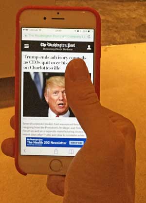
Take a look at The Washington Post’s website:

They have put a hamburger menu icon in the top left. Which is what a lot of websites do.

What’s wrong with this? It puts the menu icon in the on exact place that the majority of users cannot reach with their thumb:

Not great then.

Recently, though, there has been a move to clamp down on this. The UX community has begun to beat the drum of mobile-first navigation. Which is a good thing, because it is about time.

Thinking mobile-first

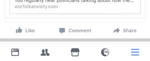
While web designers have been slow to adapt, app designers have not. Because they actually apps, no doubt. Take a look at most of them and you will see the navigation is on the bottom. Where your thumb is.

Here is the Facebook app, for example:

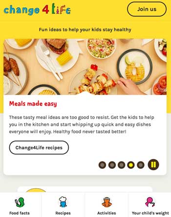
The NHS’s Change4Life website has embraced this principle, too. On the desktop, you get the navigation at the top:

But when you shrink your device to mobile size, the navigation fixes itself to the bottom:

Welcome to a much better world.

Leeds Pride 2017

August 15th, 2017 | Events

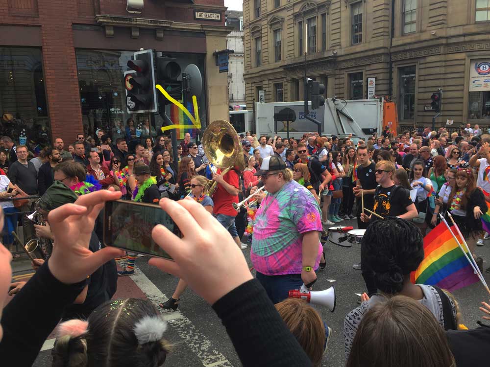
Leeds Pride continues to get bigger every year. It used to be that you could rock up to The Headrow and have an entire traffic island to yourself to watch the parade go by. Now, as you can see, the crowds are much bigger.

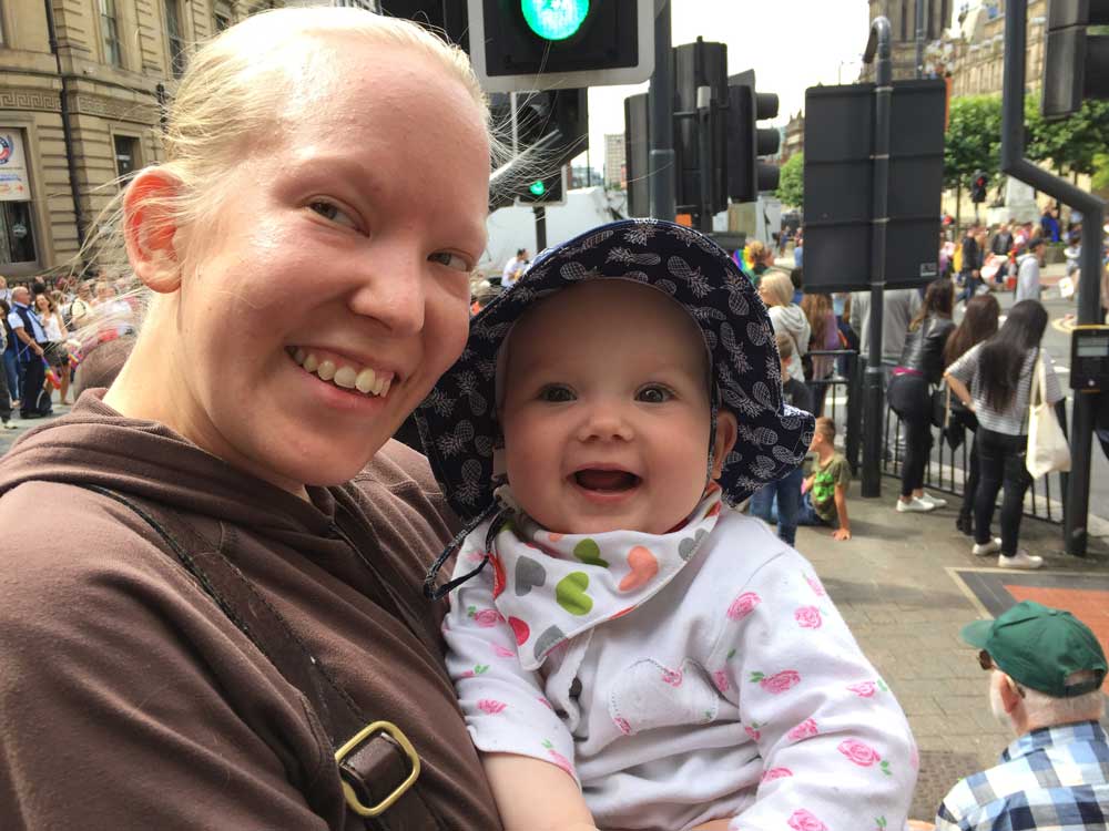
We weren’t clear if we were supporting Pride, or insensitively flaunting our heterosexuality by waving a baby around…

Craig’s Pride-themed tuba was very impressive, but I didn’t manage to get a good photo…

Venla at nine months

August 14th, 2017 | Family & Parenting, Photos

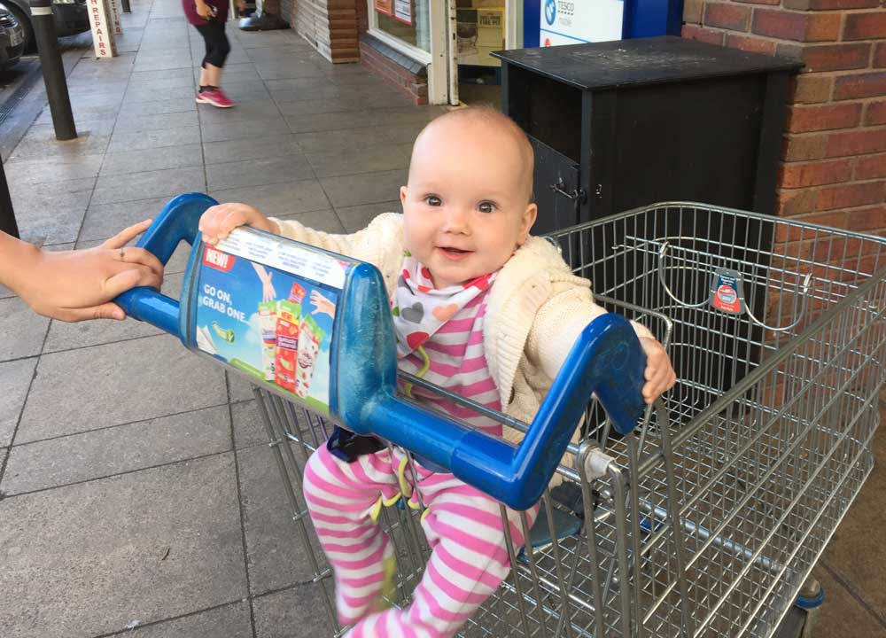
It is safe to say that Venla is now more dangerous than ever. She can shuffle. And she is quickly perfecting the art of speed shuffling: every day it gets faster. Which means she can get to draws, and pans, and balconies.

Time for shopping.

Read the rest of this entry »

Hoegaarden

August 13th, 2017 | Food

It’s my first time cooking with Hoegaarden. It is producing some interesting colours.

The Wizard of Ads

August 12th, 2017 | Books

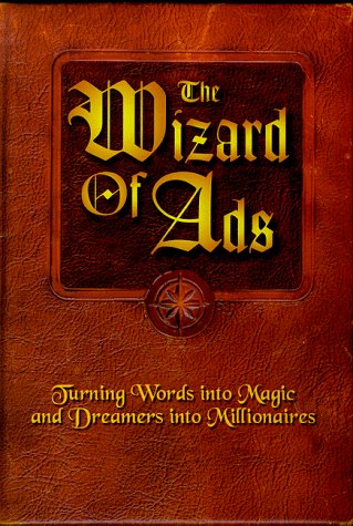
The Wizard of Ads: Turning Words into Magic and Dreamers into Millionaires is a book by Roy H. Williams.

My current series of blog posts is a clearing out and putting to bed of all the books I have half-finished. Typically, when I start a book, I finish it. But Napoleon’s Hill’s Think and Grow Rich has inspired me to give up on a bad book.

The Wizard of Ads is somewhat more interesting. But the trouble is that I have now read most of it and I am still not sure what it is about. I think it is about marketing and advertising. But the author jumps around so much that it is almost impossible to follow his chain of thought.

Indeed, there may be done. There is no real structure to the book. It is a collection of anecdotes that Williams thinks will be useful to marketers.

And they are. There is a lot of gems to be gleaned from this book. Including:

  • People are always thinking: get their attention by giving them someone more interesting.
  • Don’t train your customers to wait for a sale
  • Tell a customer what they already know or suspect. They will believe you.
  • Save people time, not money.
  • Great presentation will cause people to buy emotionally.
  • Make people feel good, don’t point out problems.

But the lack of structure of clear theme to the book making the whole thing rambling and confusing. The religious references also get tedious.

The most controversial aspect of the book is probably that Williams rejects targeting and sales it is all in the copy. This goes against what most marketers teach. Indeed, it even goes against what Gary Halbert teaches in The Boron Letters: “more than anything, give me a list of qualified buyers”.

It does have a fun title, though.

Bike & Go review

August 11th, 2017 | Sport

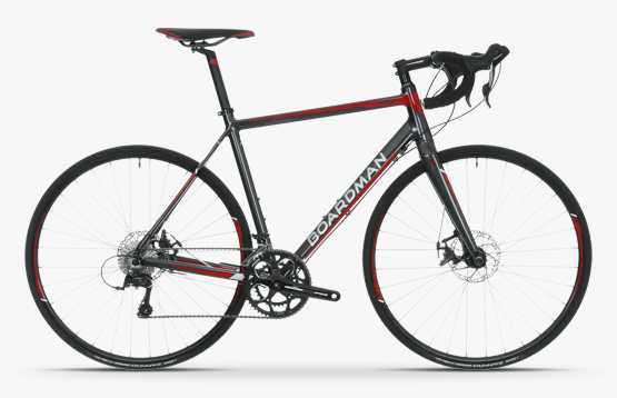
Elina and I are considering getting back into cycling. So, I did what any self-respecting young professional would do, and went out and bought a fancy bike at the cost of nearly £1,000.

Actually, I didn’t do that. What I did do was to spend £3.80 hiring a bike from Leeds CyclePoint to see if we could both still ride a bike.

It turns out that you really do never forget how to ride one. It must be 15 years since I last rode my bike and I was rather cautious about stepping back on. But as soon as your foot goes down you’re back in old habits.

The scheme is called Bike & Go and you cannot really go wrong at £3.80 per day. You can register online and get started straight away: you don’t have to wait for your membership card to turn up.

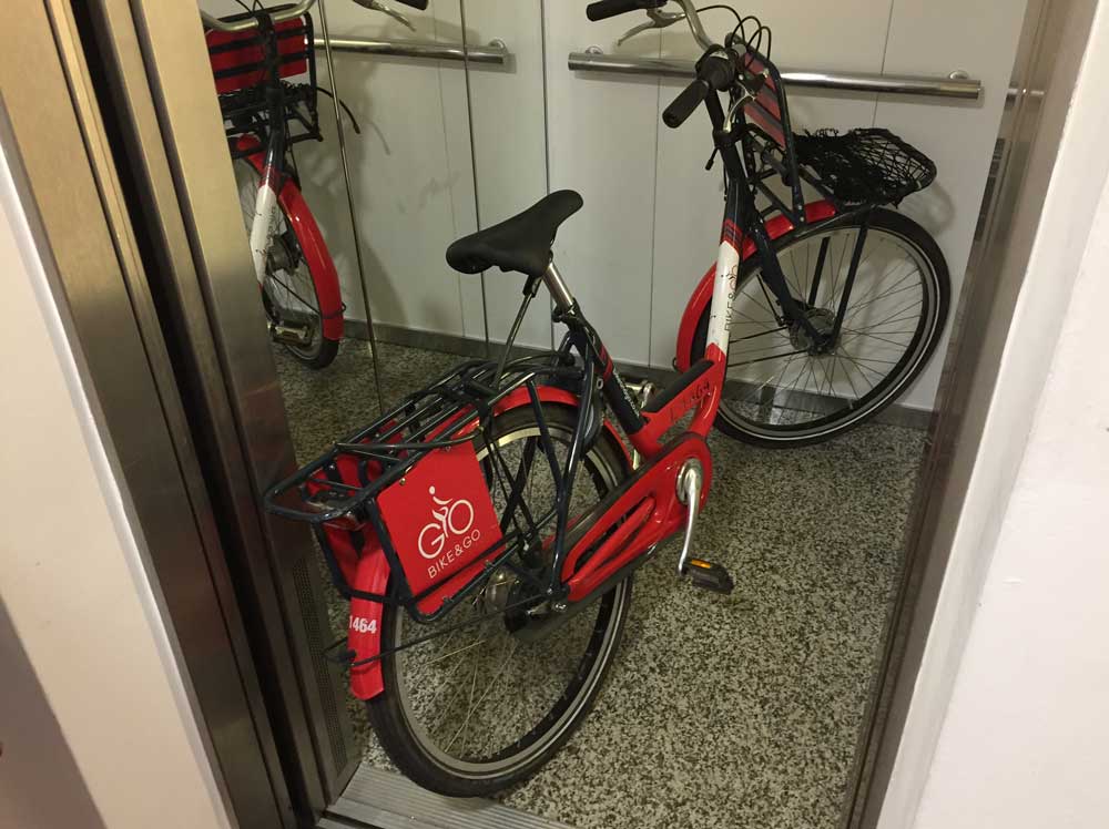
It has plenty of features, too: a kick stand, an integrated bike lock and easy-to-use hub gears.

That said, as your day-to-day bike, it wouldn’t cut it. It’s incredibly heavy. I struggled to lift it by myself. It barely fits in the lift in our apartments (might be a problem with all bikes). The seat is rock hard: even a few minutes riding leaves you sore. The brakes don’t fill you will too much confidence, either.

But, overall, it does the job. For the price of a cup of coffee.