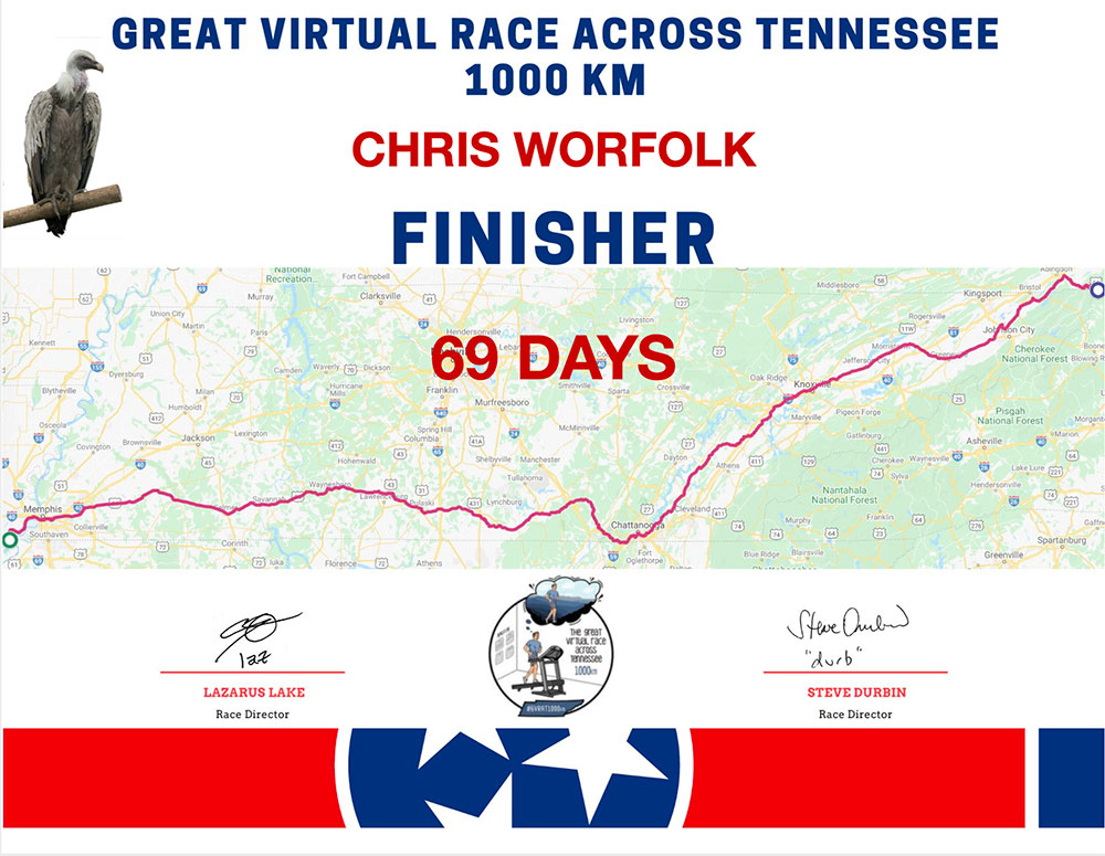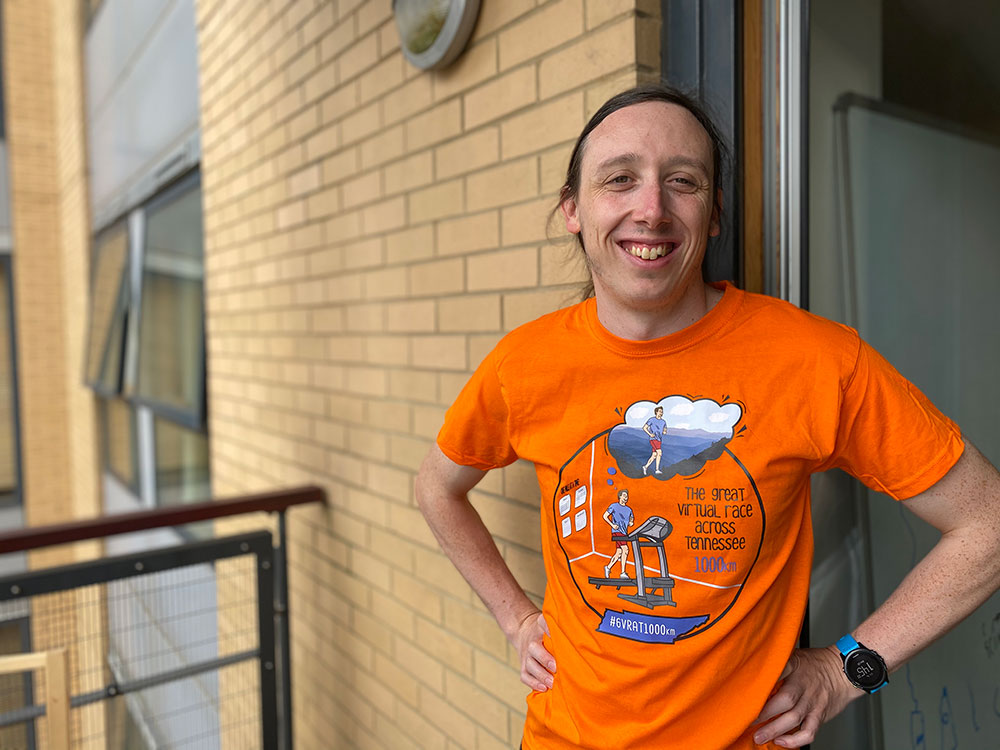
When COVID-19 struck and everything started getting cancelled, Barklay Marathons organiser Laz Lake stepped up and announced a 1,000 km Great Virtual Race Across Tennessee. Of course, it was Laz, so the distance was actually 1,022 km, but then it would be somewhat unreasonable to expect Tennessee to be exactly 1,000 km from the south-west corner to the northeast corner.
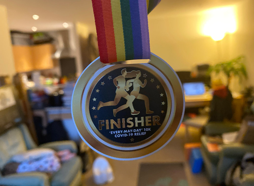
I entered the race in order to get the t-shirt, intending to make it halfway. But then I signed up for the EveryMayDay 10k Challenge and by the time I had completed that I was 40% done and thought I might as well finish the thing.
Runners need to average 8.3 km per day to make it by the 31 August deadline. 10 km gets you there three weeks early, though, and I thought I better do that in case I got COVID-19 and couldn’t get out of bed for three weeks. Then I realised that one additional kilometre, 11 km per day, would get me there on 1 August, and a double run the day before would allow me to finish in July, within three months of the race start. Things spiralled out of control from here.
Days: 69
Average distance per day: 14.81 km
Position: 2,174 / 19,605 (provisional)
Biggest effort: 86 km at Endure24
Recovery days (sub-10k): 2
Calories burnt: 74,080
Weight lost: None
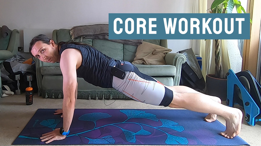
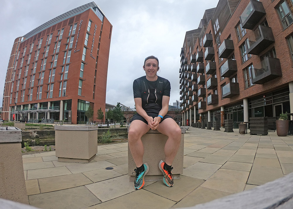
I ran most of the miles in my Nike Next% shoes, with some easier miles in my Hoka Clifton 6s when the Next%’s speed-over-comfort approach became too much for my poor feet to bear.
The elite runners managed to complete the course in less than two weeks, and have since done BAT (Back Across Tenessee) and Race That Never Ends (the 3x crossing), but I am perfectly content with a single. Especially with a surprise Ironman now less than seven weeks away.