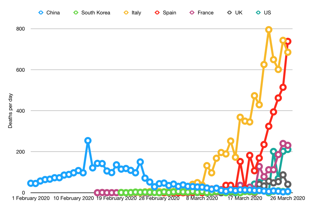
It was a bad day for Spain yesterday who reported more deaths than Italy. Italy, on the other hand, maybe showing signs of levelling off. The UK had a fairly good day, but that may be due to underreporting: the BBC said the timeframes were chopping and changing, which might explain why we had few deaths yesterday but over one hundred today.
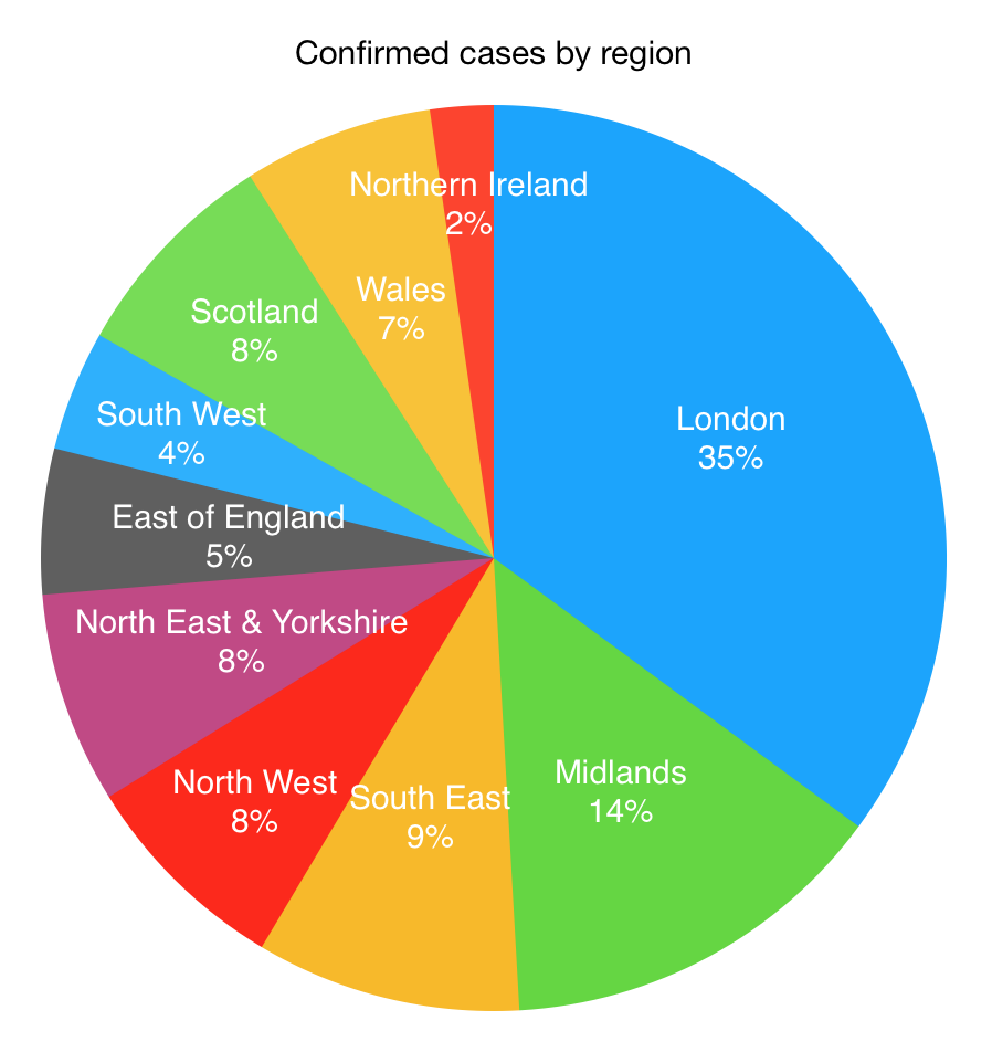
Here is the new graph for today. It shows cases across England broken down by NHS region, with the separate nations (Scotland, Wales, Northern Ireland) also getting their own slice of the pie.

A third of the cases are in London. But that is not abnormally high: they have 13% of the population and the most international travellers passing through. Still, might make you think twice before taking the tube. Otherwise, it is fairly well spread out across the country.
Don't have time to check my blog? Get a weekly email with all the new posts. This is my personal blog, so obviously it is 100% spam free.
Tags: covid-19, global health, health, pandemic
This entry was posted on Thursday, March 26th, 2020 at 9:33 pm and is filed under Health & Wellbeing. You can follow any responses to this entry through the RSS 2.0 feed. Both comments and pings are currently closed.