iA Writer review

Recently I trialled using iA Writer as my word processor of choice for writing. Previously I would use Google Docs, which has been very good. It has all the features you would expect from a word processor and automatically generates a navigation structure on the left hand side so you can quickly jump around the document.
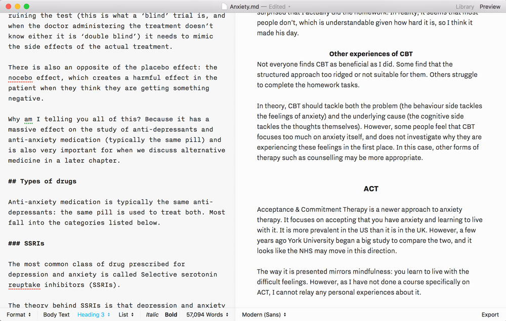
iA Writer is very different in that it is a pure text editor. It uses the Markdown syntax, so instead of a WYSIWYG editor, you get text on one side, that you have to use markup in, and a preview pane on the other. The big advantage for me, over Google Docs, is that it can handle large files. Google Docs works great, but as you start getting up to 50,000+ plus it starts to really struggle.
iA Writer handles these large files fine, but the rest is a mixed bag.
It looks really nice
The idea behind iA Writer is to allow you to concentrate on the words. This is does very nicely. You get a simple interface that you can take full screen to remove all distractions, and the layout and style are well thought out. You can enable typewriter mode so the current line is always centred on the screen, though this feels a bit like a gimmick so far.
The image support is not great/strong>
You can embed images in your articles, but you have to give them a URL. Markdown requires this, but I would have expected URI support. So I could just drop an image into the directory and say image 5 is “example.jpg”. Not so. The only way to do it is to upload it to the web, or use a full file path, such as file:///Users/me/Documents/Book/images/example.jpg.
Preview panel scrolls independently
This is one of the most annoying features: the text panel and the preview panel are not properly synced. As I scroll down one, the other one scrolls, but at a slightly different speed. Therefore the text and preview panel are always out of sync. You cannot see what you are working on, and if you scroll to that point in the preview panel, you lose your place where you are writing.
There is no navigation
Google Docs automatically generates a navigation bar on the left, based on all of your chapter titles and sub-headings. iA Writer does not do this, so the only way to navigate around a large document is to remember all of your headings and use the text search to locate them again.
This comes up a lot because you have to put references in the bottom of the document, so I am constantly scrolling down to the bottom, adding a reference, then trying to find where I was writing so that I can insert the appropriate footnote marker and continue working.
Summary
iA Writer is a nice piece of software. However, it feels like nobody has put a really large document in there and thought “is this usable?” Given it is specifically targeted at writers, I am not sure how they imagined it would be used, or maybe did not think through the use-cases beyond somebody writing fiction linearly.