Posts Tagged ‘css’

Front-End Web Development course

Wednesday, December 9th, 2020 | News

I have published a lot of courses on web development and programming but I don’t think I have ever done a back-to-basics beginners’ course before. That changes today the launch of my Front-End Web Development course that teaches you how to write HTML and CSS from scratch.

SASS course

Sunday, November 22nd, 2020 | News

SASS is a preprocessor that turns CSS into a programming language. You can use includes, variables, reuse bits of code, add logic and functions, and much more.

Using SASS allows you to develop cleaner, well-organised code that is easy to update and maintain.

In this course, you will learn how to use SASS. We’ll start with a tour of the functionality before moving onto a project to put those skills into action. You can code along to pick up some real-world experience.

Preview the course on Udemy or watch the trailer below.

CSS Grid course

Wednesday, May 13th, 2020 | News

I’m pleased to announce the launch of my new course, Introduction to CSS Grid. If you are a web developer that is not using grid yet, now is the time to jump on board before you get left behind. Grid is amazing: it is like flexbox on steroids. It is the thing that finally gives us everything we had in table-based layouts and lots more.

Here is the trailer:

Autoprefixer

Saturday, June 4th, 2016 | Programming

html-code

Web browsers come in various shapes and sizes: different users will have different ones, and inevitably different versions of the same one. When CSS3 arrived browsers began adding support for it before the specification had been finalised and so used vendor prefixes.

The result, now we have a standardised CSS3, is that some users have proper CSS3 support and some have the support, but only behind a complicated series of vendor names. Therefore, if you want to use flexbox for example, you cannot just rely on display: fiex; as for some users it will only work with the appropriate vendor prefix.

This means you have to tediously insert all of these vendor prefix statements to get cross-browser compatibility. However, there is a tool called Autoprefixer that takes this hassle away. It is an NPM module that converts your regular CSS into CSS with vendor prefixes. You write:

display: flex;

And you get:

display: -webkit-flex;
display: -ms-flexbox;
display: flex;

This means you have to compile your CSS. However, if you are already compiling from LESS or SASS, it’s really easy to integrate it. On one of my current projects I already had Gulp compiling SASS, so it was one-liner to add the step in. SitePoint have a tutorial on how to set it up.

Myth CSS preprocessor

Wednesday, January 20th, 2016 | Programming, Tech

myth-css-preprocessor

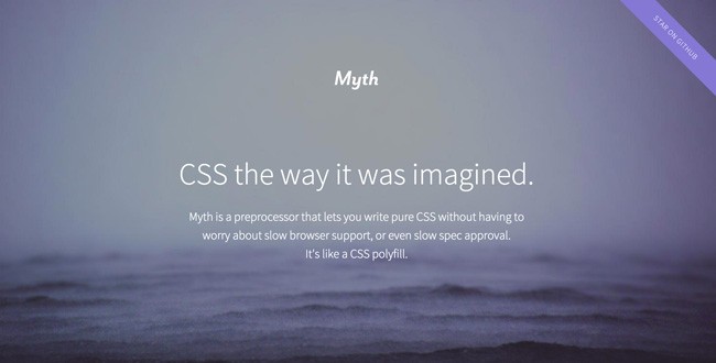
Myth is a CSS preprocessor that allows you to write easier-to-manage CSS, similar to LESS and SASS. The difference with Myth though is that you are writing “pure CSS” while still using features that will be available in the future (such as variables and maths). It then acts as a polyfill for browsers that do not support it.

You can see the full spec on the Myth website.

Should you use it instead of LESS and SASS? In my opinion, no. Not yet anyway. While it does offer some of the features, it does not offer the really useful ones yet. Nested roles and mixins are the big winners for me. Myth does not have these. Nor does it support includes.

It’s one advantage is that it does fill in prefixes. So if you are using flexbox, you can just have a flexbox entry, rather than the endless series of browser-targetted prefixed flexbox commands you currently have to use. You can do this using mixins in LESS and SASS, but it is messier than the way Myth implements it, where you just type the standardised CSS property.

While possibly not that useful right now, Myth is one to watch for the future.

Using Gulp to compile stylesheets

Thursday, June 11th, 2015 | Limited, Programming, Tech

gulp

If you’re doing a lot of CSS in your web development, you may have taken to using SASS or LESS to allow you to better organise, code and maintain your stylesheets. These are both great tools. However, the one thing that annoys me is having to remember the command to compile them, given it is often different for each project.

Luckily Gulp, a Node-based task runner, can come to the rescue.

This has the added advantage that you can also pipe it through other tools, allowing you to create maps and minify the CSS all in one command that makes it super easy.

Firstly, you need to add the dependencies so that NPM knows what to install.

{
    "devDependencies" : {
        "gulp" : "*",
        "gulp-sass" : "*",
        "gulp-minify-css" : "*",
        "gulp-sourcemaps" : "*"
    }
}

You can then run NPM install to get all the modules you need. If these are the only modules you are using you will probably need to modify your .gitignore file to ignore the node modules directory.

node_modules/

Now we can create a gulpfile.js in the root of our project directory that will define the tasks we want to run.

'use strict';
 
var gulp       = require('gulp');
var sass       = require('gulp-sass');
var minifyCss  = require('gulp-minify-css');
var sourcemaps = require('gulp-sourcemaps');
 
gulp.task('sass', function () {
    gulp.src('./sass-files/*.scss')
        .pipe(sourcemaps.init())
        .pipe(sass().on('error', sass.logError))
        .pipe(minifyCss({compatibility: 'ie8'}))
        .pipe(sourcemaps.write('./sass-maps'))
        .pipe(gulp.dest('./stylesheets'));
});
 
gulp.task('sass:watch', function () {
    gulp.watch('./style/*.scss', ['sass']);
});

The first task creates a “gulp sass” command that takes the SASS file, converts it to CSS, minifies it, builds the source map and then writes it out. I’ve set the compatibility to ie8, though it could also be ie7, and defaults to ie9.

The second task creates a “gulp sass:watch” which watches the files for changes and then calls the first task whenever it detects a change.

If you are using LESS you will need a slightly different set of dependencies.

{
    "devDependencies" : {
        "gulp" : "*",
        "gulp-less" : "*"
    }
}

The tasks are slightly different too, but basically do the same thing.

'use strict';
 
var gulp = require('gulp');
var less = require('gulp-less');

gulp.task('less', function () {
  return gulp.src('./app/resources/less/*.less')
    .pipe(less())
    .pipe(gulp.dest('./app/webroot/css'));
});

gulp.task('less:watch', function () {
    gulp.watch('./app/resources/less/*.less', ['less']);
});

The end result of this is that rather than remembering what the specific paths for any project I want to work on, I can create a Gulp task and simply run “gulp sass” or “gulp less”. I could even just rename them to “gulp css” to use the same name on every project I work on.

CSS properties worth remembering

Tuesday, June 4th, 2013 | Limited, Programming

A lot has changed since I wrote my first line of CSS – which is probably going on a decade ago now. Other things have been there all along, but have sometimes been overlooked or neglected. Below is a collection of CSS that it is easy to forget exists.

Selectors

Obviously you can use . # * etc, but there are actually far more options. As well as chaining them (p, div) and specifying them being inside each other (p div) you can also specify they must be the parent (p > div) or immediately after one another (p+div).

As well as checking attributes (input[type=text]) you can also do contains (input[title~=something]) and starting with (input[type|=something]).

We’re probably all familiar with :visited and :hover states, but there are actually dozens you can use – :focus, :first-letter, :first-line, :first-of-type, :last-of-type, :only-child, :empty, :enabled and “checked just to name a few.

Sizing in rem

It’s good practice to use em sizing to make everything relative – that way if a user scales up the page then everything stays in proportion (though modern browsers tend to handle this well anyway). But isn’t it annoying that it stacks? A 2em value inside a 2em value will give you a font size of 4.

You can solve this by using rem. Specifying 2rem will make it 2 x the root (html) element of the document – so you can make it all relevant to that and not worry about nesting.

Gradients

You can add gradients as backgrounds and even create complex patterns with multiple colours starting and stopping at different points.

background-image: linear-gradient(bottom, #22E7D2 12%, #3EFFFC 56%, #2FAB24 100%);

Shadows

It’s simple to add a drop shadow to an element.

box-shadow: 10px 10px 5px #888;

You can add it to text as well.

text-shadow: 2px 2px #ff0000;

Box sizing

Tired of having to work out what width you want something to be, then taking off the padding and the border? Sometimes maybe you don’t even have the option to do that because you want it to be 100% wide. Box sizing to the rescue. Set the box sizing to border and it will calculate the width factoring these properties in.

box-sizing: border-box;

Border radius

Want some nice rounded corners? Easy.

border-radius: 5px;
border-top-left-radius: 3px;
border-bottom-right-radius: 10px;

Clipping

You probably shouldn’t clip as it means you’re sending an image to the browser that is too big and then cutting it down. However, the functionality to do it does exist within CSS>

position:absolute;
clip:rect(0px,70px,100px,0px);

There is a background-clip property too.

Columns

Want to present your text in a series of columns? Theres a property for that.

column-count: 3;
column-gap: 5px;

LESS & SASS

Thursday, July 19th, 2012 | Limited, Programming, Tech

Still writing regular CSS? Pfft, you’re living in the dark ages! These days it’s all about two new technologies that are almost identical, so I’m going to discuss them in the same post.

The idea is dynamic stylesheets – bringing concepts we use every day in regular programming and implementing them in stylesheets to avoid duplication and make everything cleaner, nicer and more up to update with current paradigms.

So what can you do with these tools? Here is a quick overview…

Variables

Using a colour everywhere that you might want to change later? No worries, just save it as a variable and if you do need to change it at a later date, you just update the variable and it will be changed everywhere.

@myColour: #FFCC00;

.header { background: @myColour; }
.footer { background: @myColour; }

Mixins

Inheritance! What a sexy thing to have in CSS. No longer do you have to place loads of DOM references in lots of different places. Now you can just write it once and included it wherever else you need it.

.bigBorder { border: #FF99CC 10px solid; padding: 5px; }
.header { .bigBorder; background: @myColour; }
.footer { .bigBorder; background: @myColour; }

Nested rules

This one is a huge time saver! How many times have you had to reference half a dozen elements in one DOM reference? Probably very rarely, but certainly two or three tags is the every day reality. No longer though, because you can now nest your rules.

.header {
	.bigBorder
	
	a {
		font-size: 200%;
	}

In this example, the 200% font size will only apply to a tags inside .header, just as if you had done .header a in your DOM reference.

Operations

Want to make a header colour slightly darker? No worries, just add two colours together.

@mainColour: #FFCC00;

.header { background: @mainColour + #333333; }

But these are just a few of the features of these languages. They allow you to do a lot more – including things like full blown functions that you can pass parameters into, guards and much more.

The main difference between LESS and SASS is that LESS is a client-side JavaScript library (although has now been ported to Node) – you send the browser your .less file and include a JavaScript library that converts it. Meanwhile, SASS is a Ruby Gem that compiles a stylesheet to send to the client each time you edit your .sass file.

To find out more, visit the LESS and SASS websites.

Formatter Library

Thursday, May 3rd, 2012 | Tech

If you’re like me, which seems unlikely as statistically you’re probably far more sensible, you’ll get really annoyed when the white spacing or indentation isn’t consistent within a file.

Because of this, I recently wrote a little Ruby script which would automatically clean up my CSS files and make them all nice and pretty. It’s now publicly available on Github if you want a copy.

At some point in the future I’m intending to do similar scripts for other file types – the SocietasPro codebase already has a similar system for PHP, though that only flags inconsistencies, it doesn’t correct them.

Tables are back baby

Monday, February 16th, 2009 | Tech, Thoughts

Well, sort of. AJaxian wrote a very interesting post about display: table CSS and how after all this time of moving away from table layouts to CSS layouts we are now putting it all into CSS so we can essentially use table layouts again. It’s about time.

We’ve all spent years moving over to CSS layouts and support has gradually been getting better but we still can’t do a lot of basic stuff that you can do with tables without lots of hacks and crazy implementations that shouldn’t be there.

Take for example creating columns. We’re still using faux background images to create the column backgrounds and then putting a clear: both div below everything which shouldn’t really be there in semantic mark-up because it has no meaning, it’s just a CSS hack. These are things we could do with ease using tables.

While I’m on the subject there is also an interesting article on TJK Design about building layouts without using floats, the site being built entirely using lists which degrades beautifully if you turn off CSS.