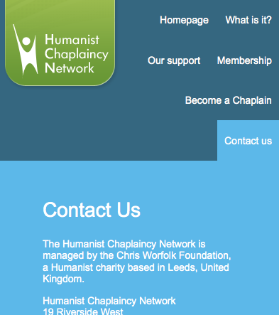
A lot of the Chris Worfolk Foundation websites, such as this one, were already responsive. That is to say that they worked well across any device size. Some of them were not however, but I’m pleased to announce we have now fixed that.
I’ve already blogged about the Worfolk Lectures update but we’ve also upgraded many other sites across our estate too:


Don't have time to check my blog? Get a weekly email with all the new posts. This is my personal blog, so obviously it is 100% spam free.
Tags: responsive web design
This entry was posted on Saturday, May 23rd, 2015 at 11:02 am and is filed under Foundation, News. You can follow any responses to this entry through the RSS 2.0 feed. Both comments and pings are currently closed.

