ChrisWorfolk.com v6.2
Tuesday, February 7th, 2017 | News
Earlier today, I pushed version 6.2 of my website live. I think we can say with reasonable certainty that you will be less excited about than I am. However, life is not about the opportunity you are handed. It is about what you do with it. So smile and think to yourself “wow, that is interesting!”.
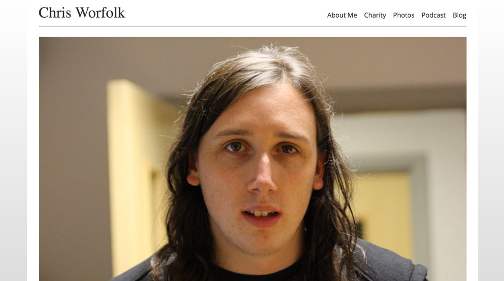
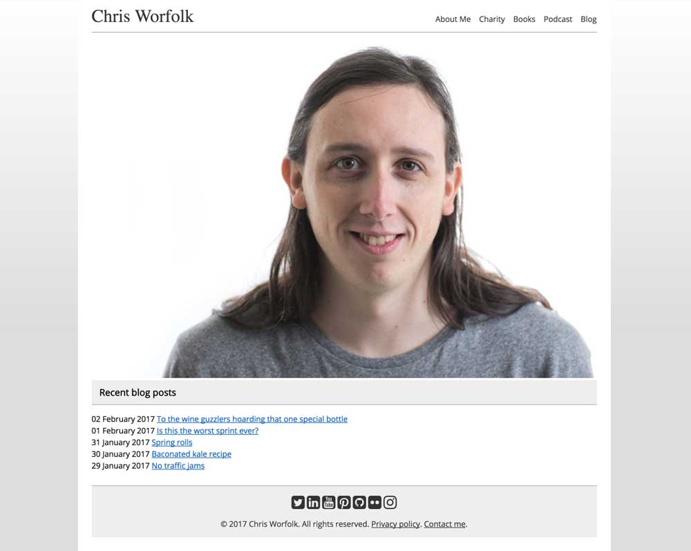
Not much has changed. It looks mostly the same. On the homepage, the giant picture of my ugly face has been replaced by another giant ugly picture.
Books page
I have replaced the photos link at the top (photos can now be found in the “about me” section) with a page detailing all of my books. I like my photos, but most people are probably not looking for a gallery of shots when they visit the site. It is much better to follow me on Flickr.
About me sections
Most people are probably looking for one of three things when they visit my site: to find out more about my tech consultancy, to explore my food writing or to check out my work in mental health and wellbeing. To make this easier, the about me section is now divided along these three lines.
Social media
I’ve added all of my social media links to the footer. Why anyone would want that much Chris, I have no idea. Probably nobody does. But Elina might find them useful.
Earlier today, I pushed version 6.2 of my website live. I think we can say with reasonable certainty that you will be less excited about than I am. However, life is not about the opportunity you are handed. It is about what you do with it. So smile and think to yourself “wow, that is interesting!”.
Not much has changed. It looks mostly the same. On the homepage, the giant picture of my ugly face has been replaced by another giant ugly picture.
Books page
I have replaced the photos link at the top (photos can now be found in the “about me” section) with a page detailing all of my books. I like my photos, but most people are probably not looking for a gallery of shots when they visit the site. It is much better to follow me on Flickr.
About me sections
Most people are probably looking for one of three things when they visit my site: to find out more about my tech consultancy, to explore my food writing or to check out my work in mental health and wellbeing. To make this easier, the about me section is now divided along these three lines.
Social media
I’ve added all of my social media links to the footer. Why anyone would want that much Chris, I have no idea. Probably nobody does. But Elina might find them useful.