ChrisWorfolk.com v6.1
Friday, May 13th, 2016 | News
Version 6 of my website has been around for a few years now and I am pretty happy with it. It is simple, responsive and says what it needs to say. However, the internet is an ever-evolving place, and so an update felt in order. Here is what has changed in version 6.1.
Design
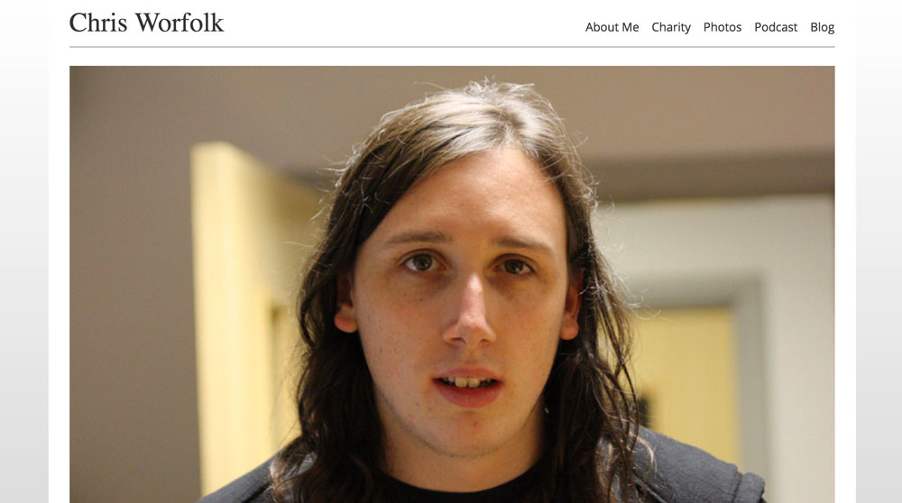
I have switched from Arial to Open Sans. It is an elegant font and as you can probably guess from the name, open source. It is used by Google as their standard font. Along with the font change, the font size has now been standardised, and is bigger than it used to be. This makes everything easier to read, especially on a smaller screen.
There is also more space, in two respects. First the headers are now bigger and more spaced out. Second the header will no longer stay glued to the top of the page if you are on a small screen. Mobile users will now see the navigation bar disappear as they scroll, freeing up more reading space.
Content
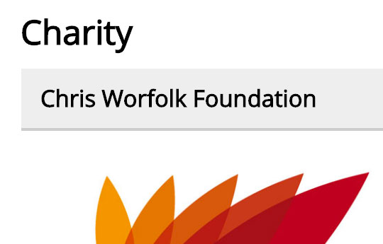
The content pages have had an overhaul. Some of the information on the about me and charity pages was getting a little old. This has now all been updated. The videos page now works with YouTube’s new feed, so you can once again see a list of video previews on the page.
Images
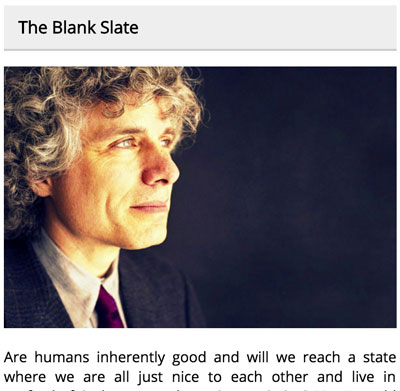
Previously, the images were a little on the small side. They worked fine on the tiles you see on a larger screen, but did not fit to 100% width on a mobile screen. These have all now been replaced by larger versions so no matter what size screen you have, you will see the perfect image size.
Blog
My blog has received some attention too. I have removed some of the distracting features like the tag list included in the post listings. The date and categories are now in the sub-heading bar, with no meta data underneath until you click through into the post’s page.
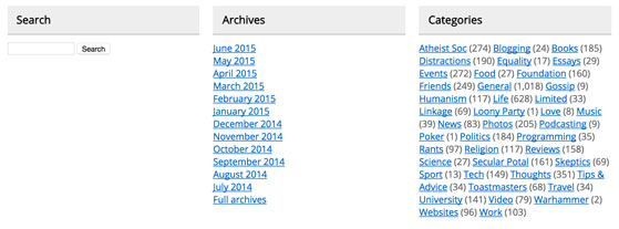
The sidebar has also been moved to the bottom of the page. This is where it was on mobile anyway. Instead of getting a list of 100 months to browse, you now get the past year with the option to click through to the archives page if you want to see a full list. I’ve also added a sitemap to make it easier to search.
Speed
Those larger images eat up a bit more bandwidth. Luckily, speed improvements elsewhere in the site help make up for it. All of this is ‘behind the scenes’. Images and static assets now have appropriate cache headers, the CSS is compressed and everything is delivered via gzip. The homepage’s blog post feed now loads faster too.
Version 6 of my website has been around for a few years now and I am pretty happy with it. It is simple, responsive and says what it needs to say. However, the internet is an ever-evolving place, and so an update felt in order. Here is what has changed in version 6.1.
Design
I have switched from Arial to Open Sans. It is an elegant font and as you can probably guess from the name, open source. It is used by Google as their standard font. Along with the font change, the font size has now been standardised, and is bigger than it used to be. This makes everything easier to read, especially on a smaller screen.
There is also more space, in two respects. First the headers are now bigger and more spaced out. Second the header will no longer stay glued to the top of the page if you are on a small screen. Mobile users will now see the navigation bar disappear as they scroll, freeing up more reading space.
Content
The content pages have had an overhaul. Some of the information on the about me and charity pages was getting a little old. This has now all been updated. The videos page now works with YouTube’s new feed, so you can once again see a list of video previews on the page.
Images
Previously, the images were a little on the small side. They worked fine on the tiles you see on a larger screen, but did not fit to 100% width on a mobile screen. These have all now been replaced by larger versions so no matter what size screen you have, you will see the perfect image size.
Blog
My blog has received some attention too. I have removed some of the distracting features like the tag list included in the post listings. The date and categories are now in the sub-heading bar, with no meta data underneath until you click through into the post’s page.
The sidebar has also been moved to the bottom of the page. This is where it was on mobile anyway. Instead of getting a list of 100 months to browse, you now get the past year with the option to click through to the archives page if you want to see a full list. I’ve also added a sitemap to make it easier to search.
Speed
Those larger images eat up a bit more bandwidth. Luckily, speed improvements elsewhere in the site help make up for it. All of this is ‘behind the scenes’. Images and static assets now have appropriate cache headers, the CSS is compressed and everything is delivered via gzip. The homepage’s blog post feed now loads faster too.